Tutorial Step 7: Connecting Two Building Blocks
At this point in the tutorial, the introduction to the subtleties especially of the visual presentation of a template begins. In the example, the step switches (plus/minus °C) are to be visually combined. To start, let's look at the basic layout of individual building blocks:
The rendering of building blocks (and thus of templates, panels, and controls) currently takes place exclusively in HTML, and visual adjustments also exclusively with the possibilities of CSS.
A building block is always embedded in a container (dashboard-control-container) whose boundaries cannot be exceeded. Relative to this container, the building block is arranged as follows — depending on the type of building block, an alternative display can also be chosen:
- There is an outer margin based on the CSS variable margin — this is usually defined along with many others by the theme of the panel. The default value is 0.2em.
- This accordingly limits the available height and width of the actual building block. This area generally receives rounded corners (border-radius) based on borderRadius with a default of 8px.
- Usually the building blocks indent their actual content a bit more (padding), using padding as unit with a default of 0.5em.
This is what it looks like for a static text:

- The outer light grey frame is the background of the template in development mode.
- The thin light grey frame is the outer margin.
- Slightly reddish comes the inner indentation (padding).
- And here greenish is the background of the payload of the building block.
Now you should also understand the preset height 24 of building blocks with text content: 24 means the height is 2.4em. Of this, 0.4em goes to the outer margin and 1em to the inner indentation, so exactly 1em remains for the actual text.
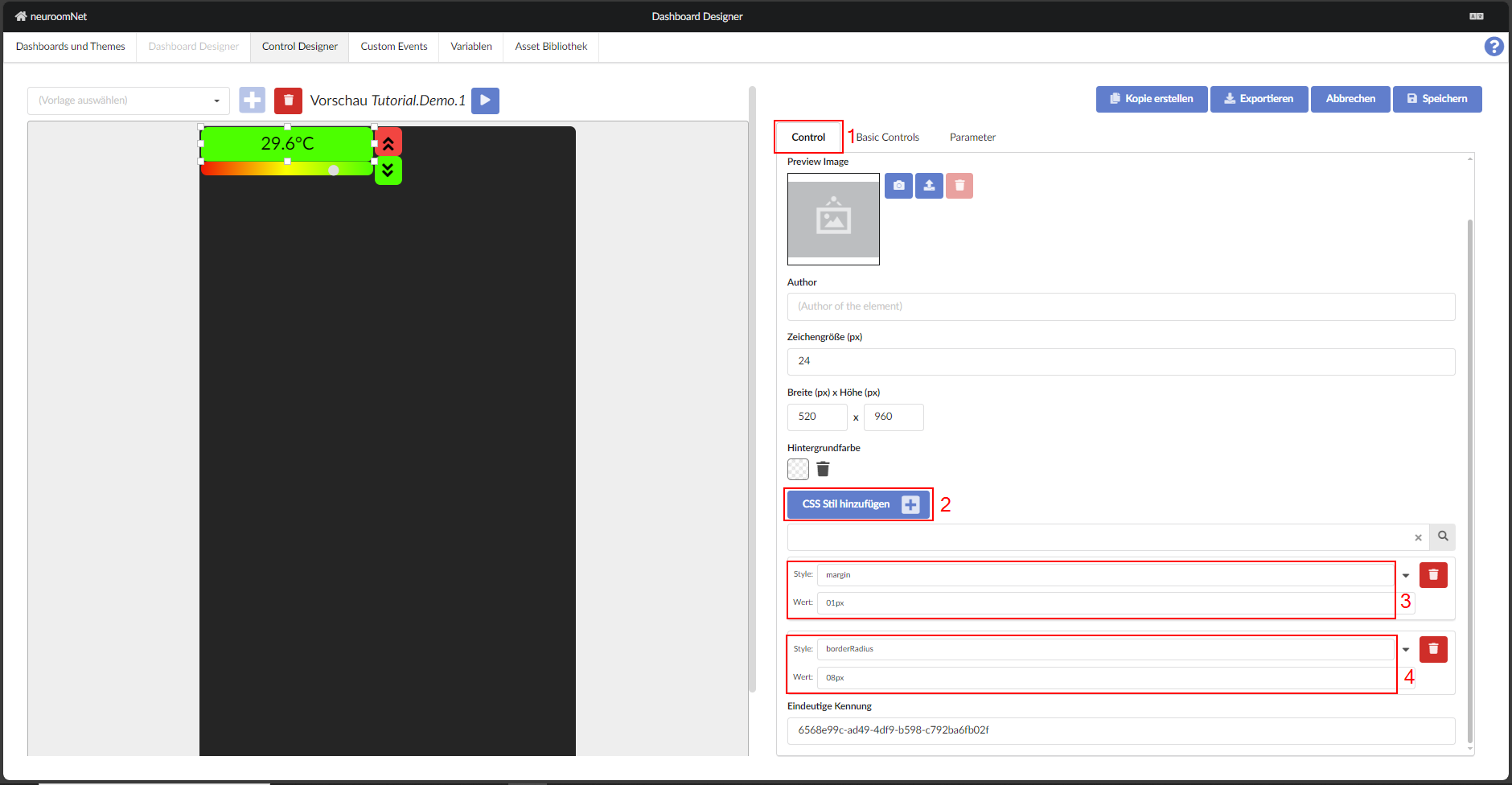
To avoid having to edit the individual elements in the control, some styling can be applied to the control via the "Control" tab by adding new CSS styles.
Note
Pay attention to capitalisation — "borderRadius" not "borderradius", for example.
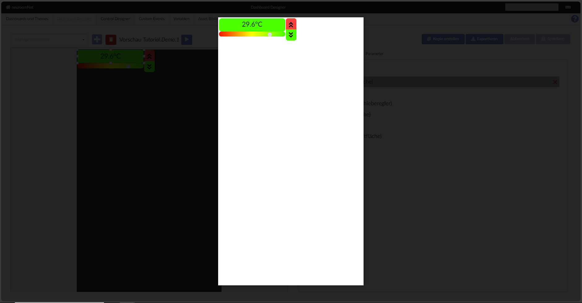
So what needs to be done to arrange two building blocks directly on top of each other?
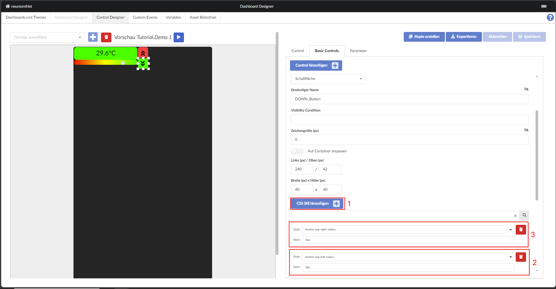
The fine-tuning is done with the custom style of the building blocks (Button). To do this, the rounded corners are first removed on one side. For the upper building block — analogously of course for the lower one:

For the lower building block, note "top" instead of "bottom":
There are certainly several ways to correct the appearance. In this case, adjusting the position coordinates seems simplest:
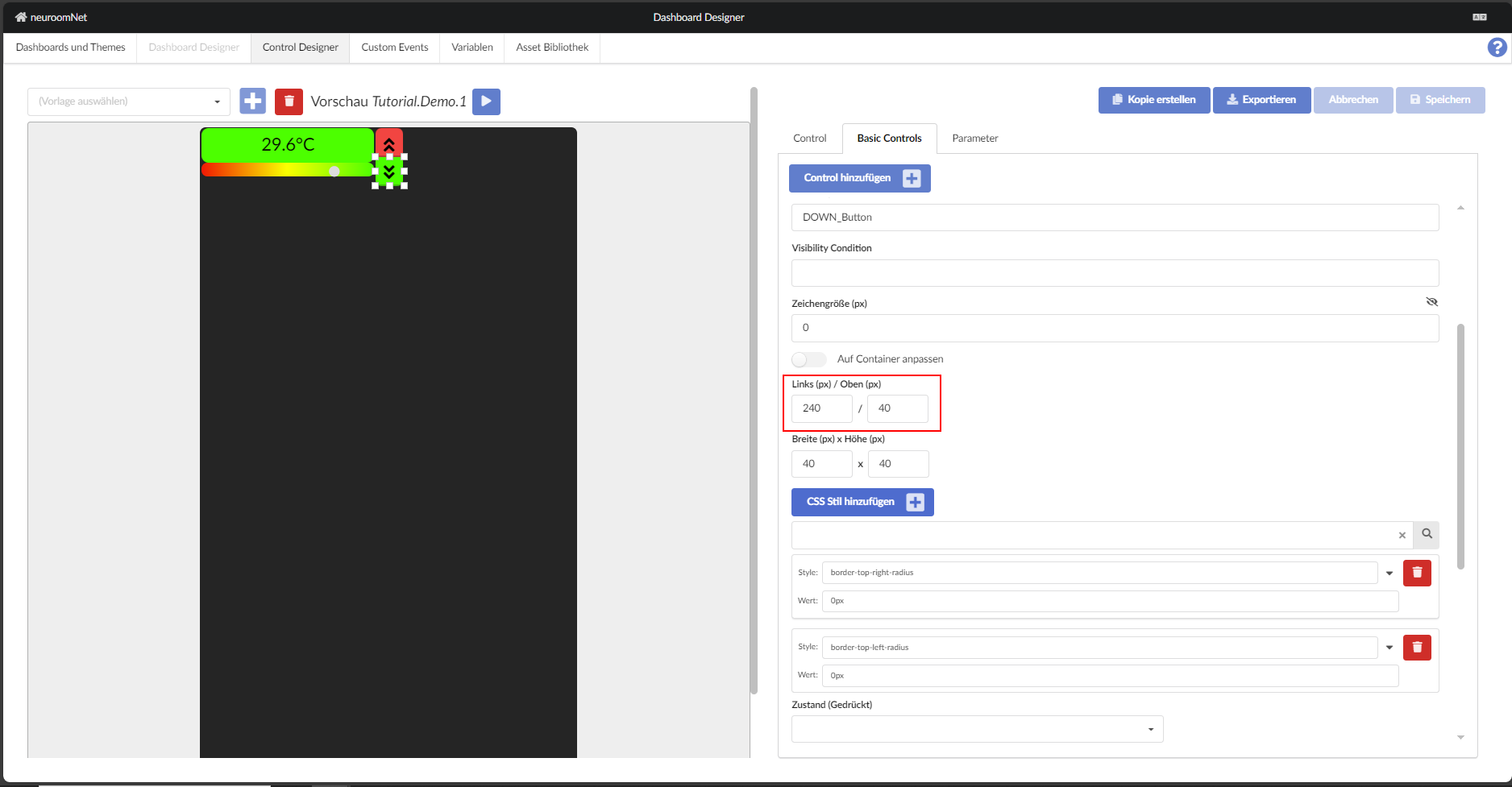
Now the control should look like this: