Panels - NEW
This chapter was updated for NeuroomNet 2023.3 on 01.10.2024
On a panel, controls are offered in optionally multiple areas with which the user can interact and thereby trigger events especially for media control. Each control is created as a copy of a template and configured appropriately.
In operation, panels are grouped into controls (dashboards), where a control references one or more panels — a single panel can therefore be made available via different dashboards. If a control contains multiple panels, in addition to the active panel, navigation to switch between the pages is also offered. But for now it is just about creating individual panels.
Structure of a Panel
A panel has a fixed size defined in width and height in pixels. Especially for many fixed installed control units, this also makes sense and ensures that a panel is always displayed in the same way.
When maintaining a panel, it is always displayed in the preview in the fixed aspect ratio and automatically scaled to the available screen area. This may result in an empty fill area above and below or left and right (letterbox).
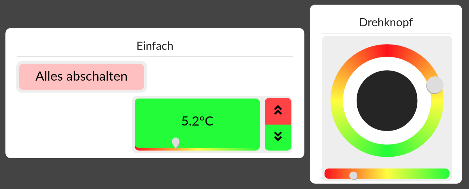
A panel is divided into freely selectable areas that can have a heading — in the example these would be "Simple" and "Rotary knob". Controls can only be created as copies of templates in areas. Depending on the desired functionality, the controls are then configured accordingly.
A display style (theme) can also be associated with the panel itself. This will make it possible to make certain visual presets for all controls on the panel together, assign a colour scheme, and so on.
Tutorial
In individual steps, a panel is to be built. This covers almost all aspects of panel development; missing or insufficiently detailed aspects will then be explained separately.