Tutorial Step 2: Insert and Configure a Control
After selecting an area, "Text Button" can be selected via the associated tab.
Using the plus symbol on the right next to it, the copy is placed on the area of the panel and can be positioned like the area on the panel with the mouse or properties
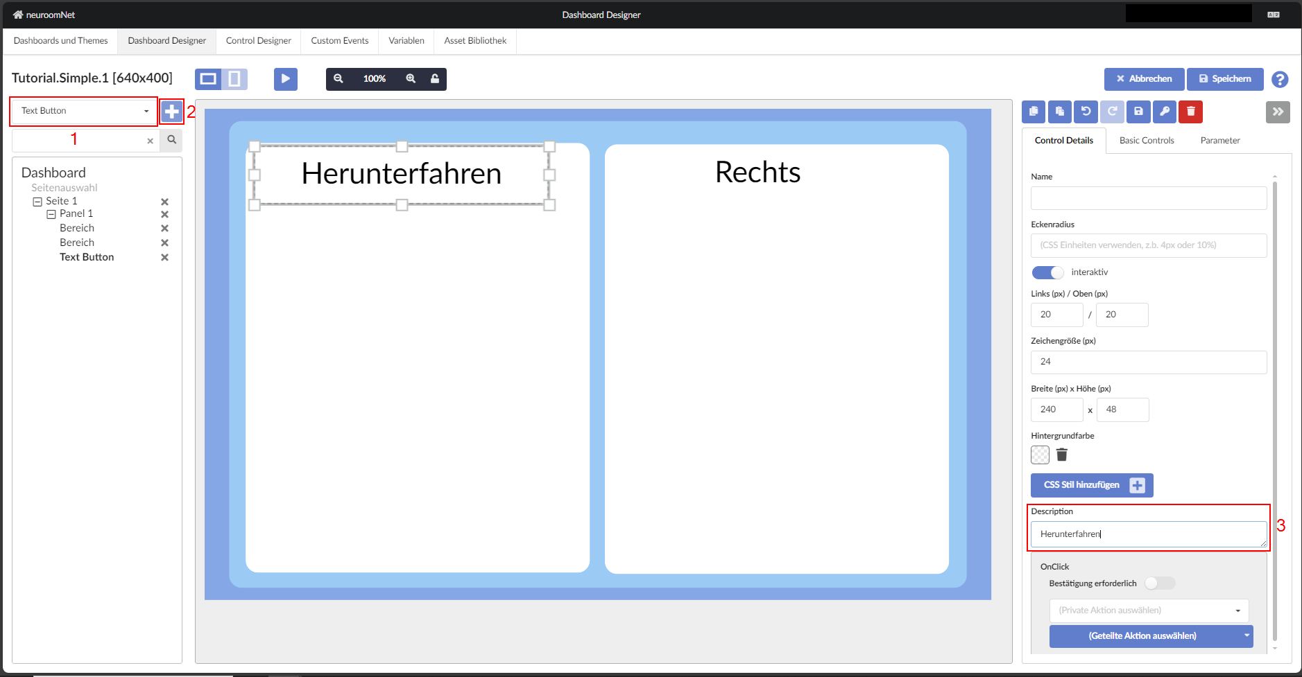
It is always advisable to give a control a name that is unique on the panel — in particular, only in this way is a unique assignment of events as triggers in media control often possible.
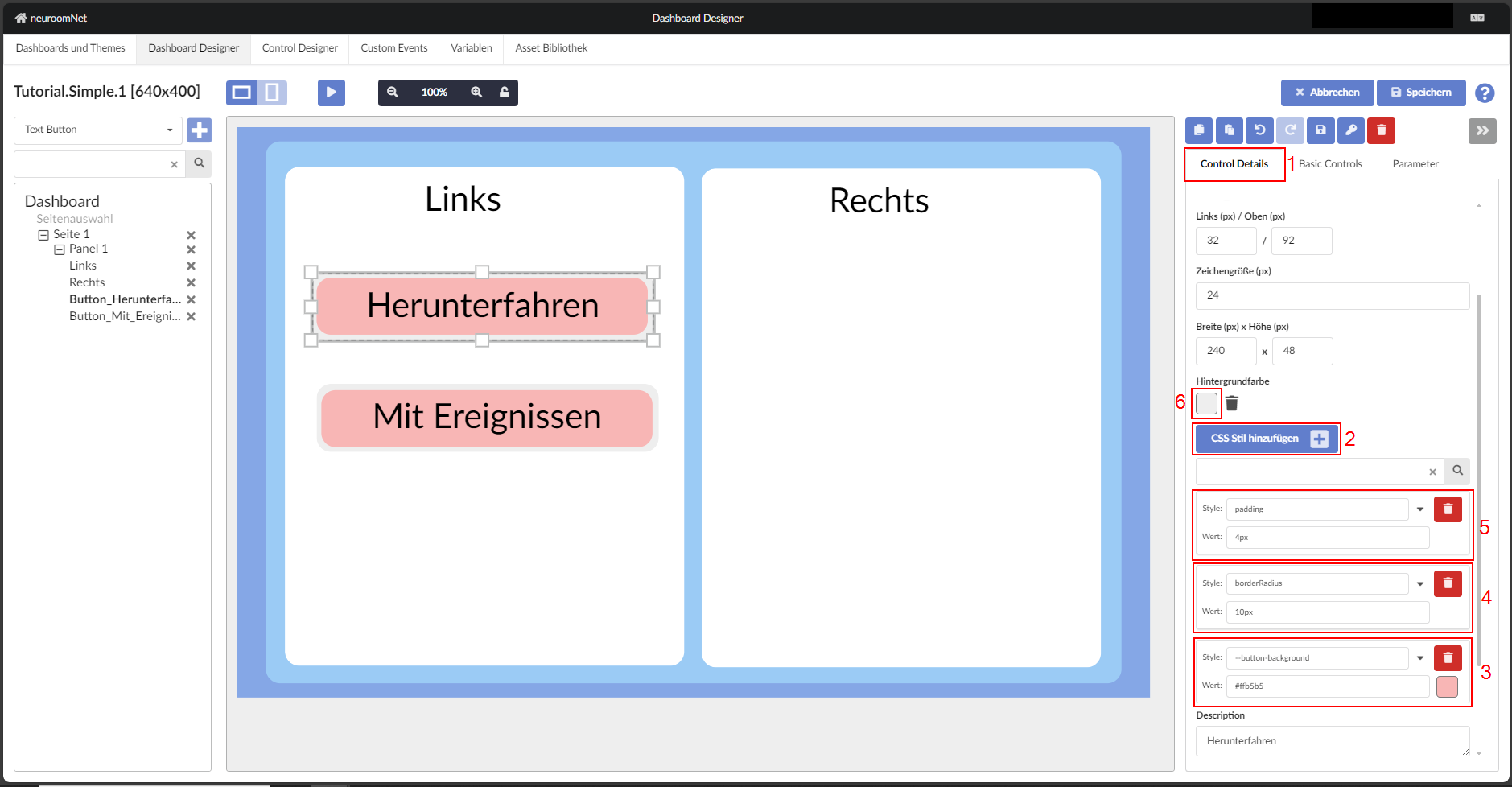
To format the "Text Button" so that it looks like the image below, change the background colour by adding a CSS style — "--button-background" and then choosing a colour. Next, round the corners by adding a new CSS style — "borderRadius" — and setting the value to 10px (don't forget to add "px"). Finally, change the background colour of the TextButton element to a light grey and add a "padding" style with the value set to 4px. The steps can now be repeated for the "With Events" button.
In test mode you can observe that the left and right areas respond to mouse movement over them. To prevent this, the activity of the buttons should be set to false. To do so, click on one of the buttons, navigate to the "Basic Controls" tab, find "Active (Enabled)" and set it to false as shown below.
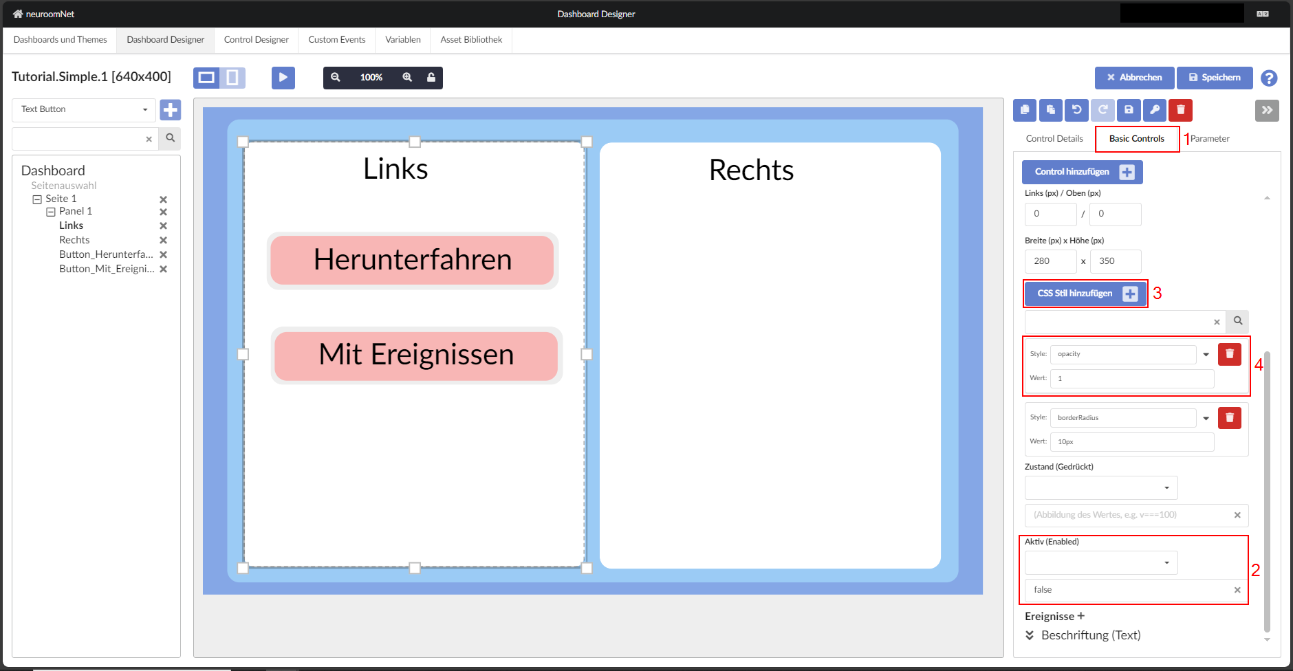
Setting the activity of a button to "false" reduces the opacity. To compensate for this, a new CSS style must be added to the button — "opacity": 1.
Note
Analogously for the right side.
Next: Configure events