Button
This page has been automatically translated and has not been reviewed in detail yet. Therefore, the translation might not be completely accurate.
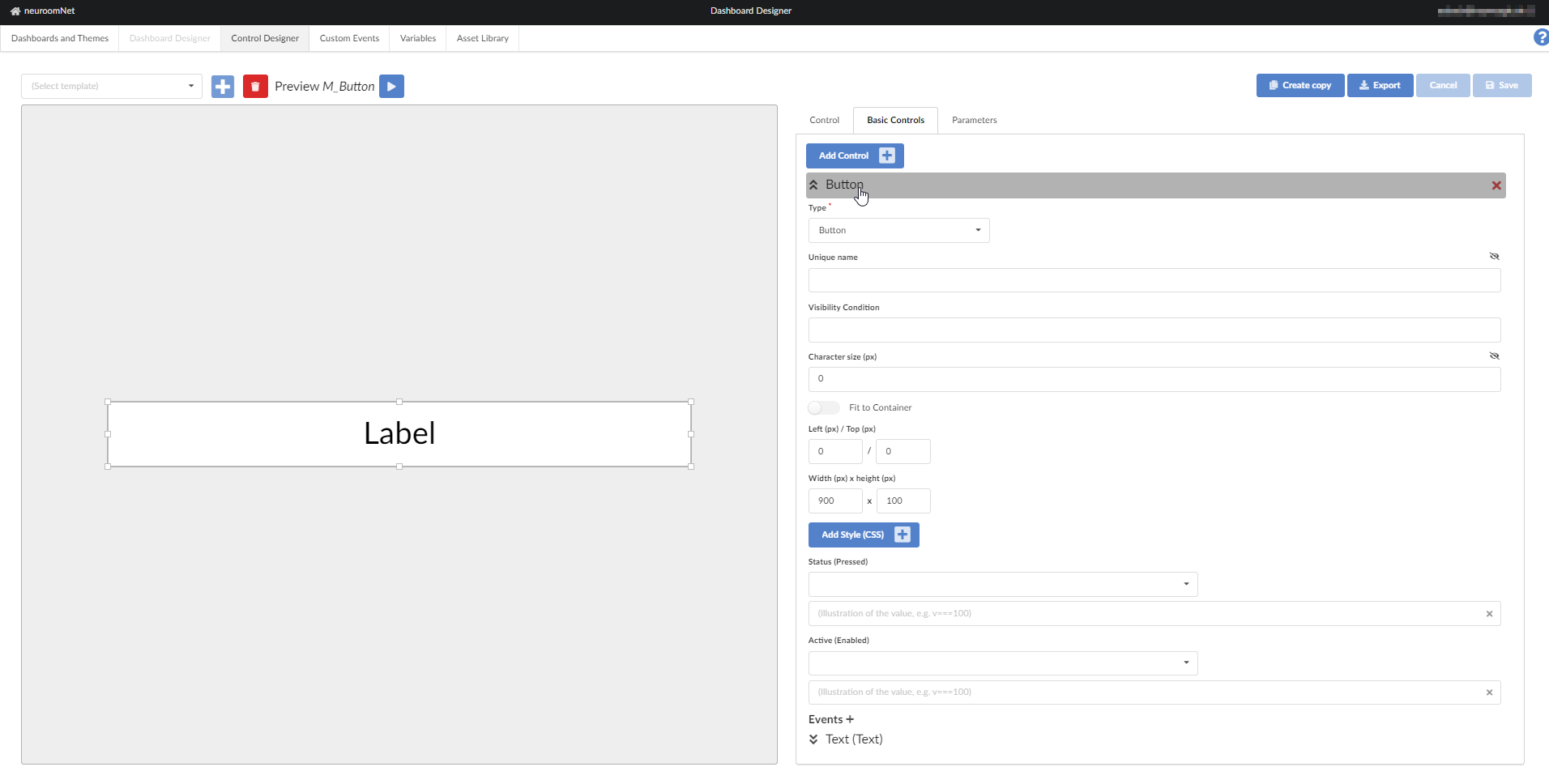
The elementary building block Button is nothing more than an interactive area. Non-interactive blocks can then be created via this (currently Text, Value, [Image](. ./basic-control-picture/index.md) or Symbol). The button then takes over the interaction with the user and offers corresponding events (onDown, onUp, onClick).
CSS Classes
- dashboardButtonControl: in the DOM the button is represented by a single HTML element (DIV), which is marked with this CSS class.
- controlEnabled: this CSS class is additionally set if the Status parameter returns the value true - this is referred to below as enabled.
- controlDisabled: analogous if the Status parameter returns false - briefly referred to as disabled. Note that the value of Status cannot return either false or true (e.g. because Status has not been assigned to a parameter). In this case the button is neither enabled nor disabled.
- controlActiveTrue: as with the Status parameter, only here the Active parameter is compared to true - the corresponding name is of course active.
- controlActiveFalse: inactive for a value of false of the Active parameter.
If the button is disabled, it does not respond to interactions.
CSS variables
- --dashboard-button-control-background, default #ffffff: the background color of the block. Please note that this is deliberately not transparent by default.
- --dashboard-button-control-active, default #00ff00: background color if the block is active.
- --dashboard-button-control-inactive, default #ff4040: background color when the block is inactive.
- --dashboard-button-control-enabled-opacity,Default 1: the CSS opacity for an enabled button. Please note that this value is also the default setting of the HTML element, so using the default settings enabled makes no visual difference.
- --dashboard-button-control-disabled-opacity, default 0.5: analogous for disabled.
In addition, the background is varied when the mouse is over the block (CSS :hover) and the button is not disabled - in this case the corresponding symbol for the mouse pointer is also activated (CSS cursor :pointer):
- --dashboard-button-control-hover-active, default #00cc00: in case the button is active.
- --dashboard-button-control-hover, default #ff8080: in all other cases, i.e. when the button is inactive or the Active parameter returns neither true nor false.
Special instructions
All CSS variables that relate to the background always set the CSS property background - and not background-color. The default settings are only fixed color values without transparency, but there are no limits to your imagination - the CSS variables can also describe color gradients.
