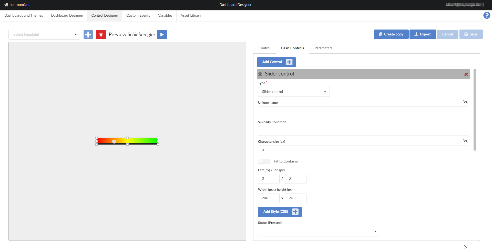
Slider Control
note
This page has been automatically translated and has not been reviewed in detail yet. Therefore, the translation might not be completely accurate.
The slider is intended to change an integer via the Source parameter by dragging a button horizontally. An onChange event is triggered.
CSS Classes
- dashboardSliderControl: the HTML element (DIV) with this CSS class describes the controller as a building block.
- controlEnabled: this CSS class is additionally set if the Status parameter returns the value true - this is referred to below as enabled.
- controlDisabled: analogous if the Status parameter returns false - briefly referred to as disabled. Note that the value of Status cannot return either false or true (e.g. because Status has not been assigned to a parameter). In this case the controller is neither enabled nor disabled.
- controlActiveTrue: as with the Status parameter, only here the Active parameter is compared to true - the corresponding name is of course active.
- controlActiveFalse: inactive for a value of false of the Active parameter.
- dashboardSliderControlInput: This HTML element (DIV) contains the representation of the button (SVG).
- dashboardSliderControlRound: this additional CSS class uses a round button.
- dashboardSliderControlDropUp: here the button is a drop with the tip pointing up.
- dashboardSliderControlDropDown: and finally with the drop, but this time with the tip down.
If the controller is disabled, it does not react to interactions.
CSS variables
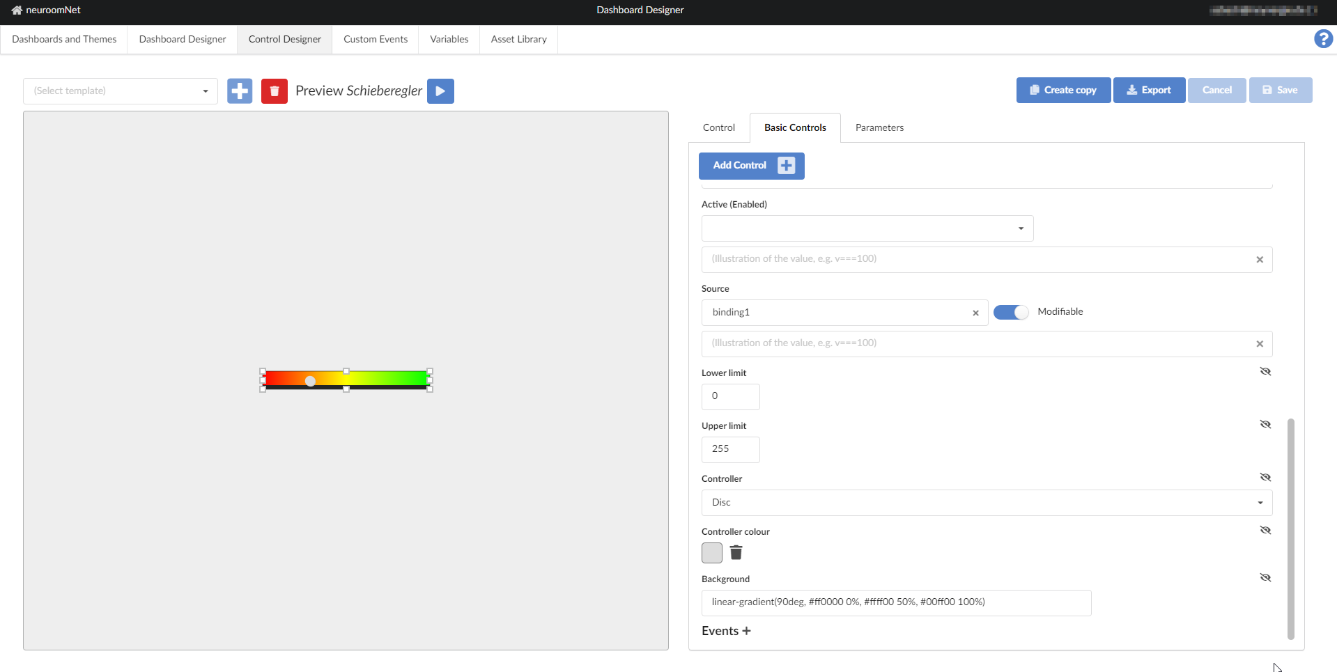
- --dashboard-slider-control-background, default linear-gradient(90deg, #ff0000 0%, #ffff00 50%, #00ff00 100%): the background of the controller - this value is only taken into account if the Background parameter is not set.
- --dashboard-slider-control-knob-size, default 1em: the size of the knob.
- --dashboard-slider-control-knob-shadow, default 1px 1px 0 #cccccc: the shadow (CSS filter of the type drop-shadow) around the Button. If this variable is not set, but --dashboard-control-knob-shadow is set, its value will be used instead of the default setting.
- --dashboard-slider-control-knob-color, default #ffffff: the color of the button (CSS fill), if not set to the overall CSS variable --dashboard-control-knob-color checked. Please note that these CSS variables are only evaluated if the Controller color parameter is not set.
- --dashboard-slider-control-round-knob-offset, default calc(-1em / 4)): an offset (CSS bottom) for displaying a round button .
- --dashboard-slider-control-up-knob-offset, default calc(1em / 12): an offset (CSS top) for displaying the drop with tip after above.
- --dashboard-slider-control-down-knob-offset, default calc(1em / 12): an offset (CSS bottom) for displaying the drop with tip after below.
Special instructions
Please note that the Source parameter is always maintained in the area of the Lower limit and Upper limit parameters. If the value is initially outside this range, it is shifted accordingly to one of the limit values. When writing back a changed value, error messages can occur if the associated parameter or variable uses a different value range.