Tab Dashboard Designer
In the Dashboard Designer tab, a dashboard can be edited, inspected, and also tested in play mode. This tab is accessed via the "Open in Designer" button in the "Dashboards and Themes" tab.
User Interface Overview
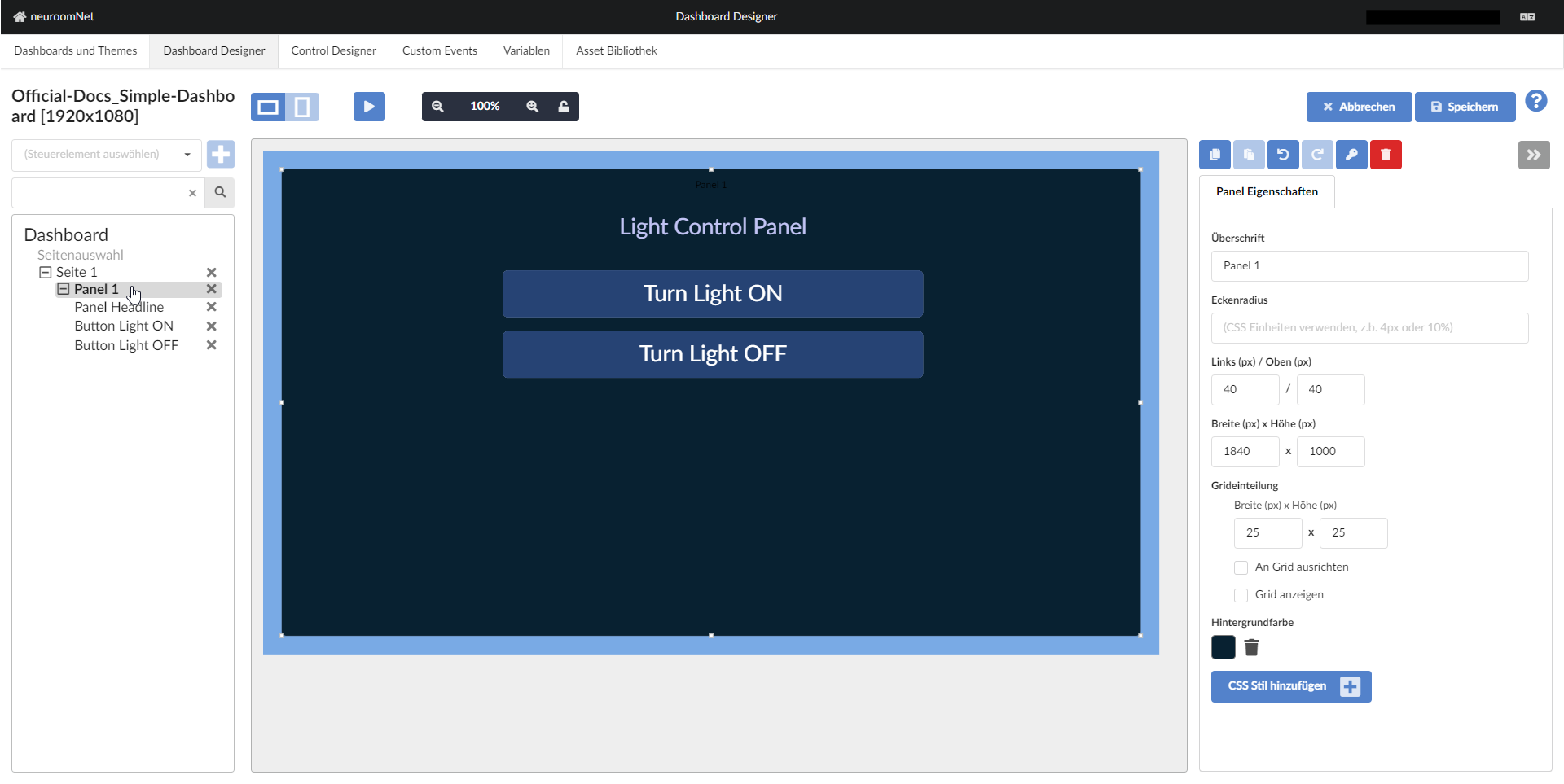
The user interface of the Dashboard Designer tab is broadly divided into 3 parts - here using a newly created dashboard as an example:
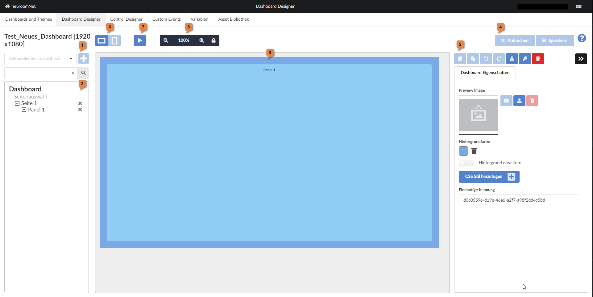
- Left part: New controls can be added to the dashboard here (combobox and + button at 1) and a structural view (tree structure) of the dashboard's controls is shown (2; in this case the dashboard only contains the controls "Page selection" and "Page 1" at the second-highest level (below the "Dashboard" itself) and as a child of "Page 1" there is "Panel 1")
- Middle part: The dashboard is shown here in its current state as WYSIWYG (but zoomed) 3
- Right part: At the top right 4 there are "Cancel" and "Save" buttons for discarding or saving changes to the dashboard since the last "Save". Under 5 buttons and attributes for the currently selected control are displayed. In this case it is the dashboard itself.
Other noteworthy buttons at this point:
- 6: Toggle between landscape and portrait format of the dashboard (if configured in the Dashboards and Themes tab, the dashboard is effectively represented by 2 separate dashboards, between which you can switch here in the designer). Currently this is not fully implemented and therefore not functional.
- 7: Activate the play mode of the dashboard. Here the dashboard is displayed in fullscreen as it would also be visible as the final web page. Depending on the settings, it may also be fully functional in this view (see "Preview executes LIVE actions" setting in the "Dashboards and Themes" tab)
- 8: Change the zoom level of the dashboard display (to less zoom, 100% zoom, more zoom, or with the key icon to the preset where the entire dashboard is visible)
Example of a More Complex Dashboard and Its Structure
See the following example of a more complex dashboard for a touch display of a presentation room including LED wall and microphones:
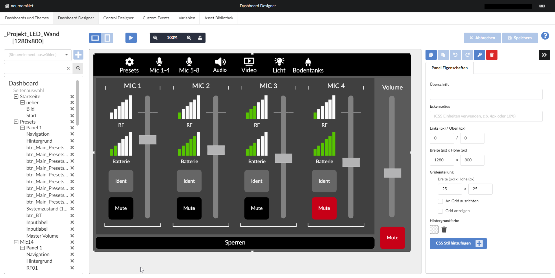
This example clearly shows the general structure of the elements of every dashboard (see the structural view on the left):
- Level 0: The dashboard itself ("Dashboard")
- Level 1: The page selection ("Page selection"; rarely really used, but technically always present) and the concrete pages (visible here: "Start page", "Presets", "Mic14")
- Level 2: Panels (visible here: "ueber", "Panel 1", "Panel 1")
- Level 3: Concrete controls, such as: "Image", "Start", "Navigation", "Background", ..., "Master Volume", "Navigation", "Background", "RF01")
Mini Tutorial
For newcomers to the Dashboard module, the following tutorial is highly recommended: Dashboard Mini Tutorial.
Further Important Functions / Functionalities of the Dashboard [Designer]
In addition to the functions and functionalities discussed so far, there is also the following in the Dashboard Designer:
In the button bar in the right part 5 the following functionalities are available:
Undo / Redo Buttons: Undo / Redo
Undo / redo of the most recently made changes to the dashboard.
Download Button: Download the Dashboard
If the dashboard is selected in the structural overview on the left, the dashboard can be exported as a JSON file (this allows a dashboard to be backed up offline or copied via a corresponding import in the "Dashboards and Themes" tab).
Key Button: Restrict Access
If the dashboard is selected in the structural overview on the left, the user profiles that are generally allowed to access the dashboard can be determined here (equivalent to the setting in the Dashboards and Themes tab, see Rights concept for dashboards).
If a control is selected in the structural overview on the left, access to the specific control can be restricted to certain user groups. In the case of buttons, these controls are then not operable.
Changes to permissions generally require a logout / login of the currently active user sessions so that the changed permissions apply to the users.
Trash Bin: Deleting Controls
Individual controls (or the entire dashboard if it is selected) can be deleted using the trash bin button.
Other Settings for Dashboards, Pages, and Panels
When a dashboard, a page, or a panel is selected, there are additional settings options not yet described:
Settings for Dashboards
The following settings options are available for dashboards:
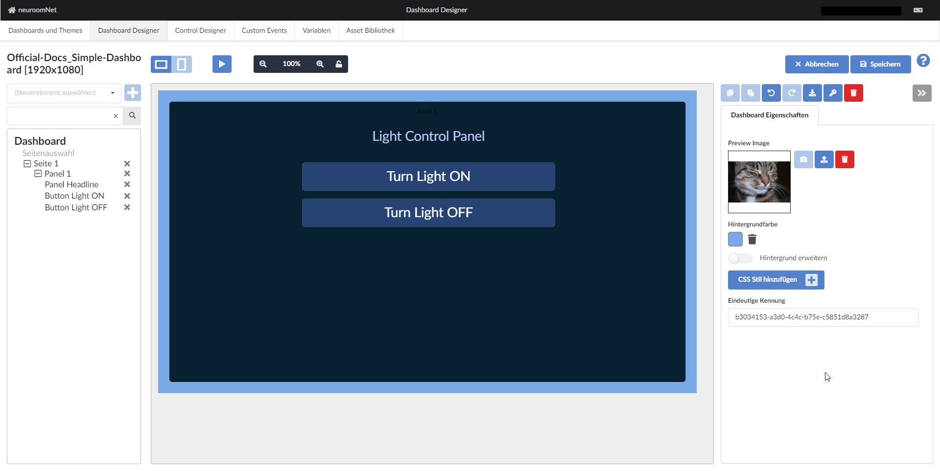
Preview Image
A preview image can be uploaded, deleted again, and a screenshot of the dashboard can be saved as a preview using the camera button (for this camera button to work and not be greyed out, the current zoom in the dashboard must be set to 100% - to do this click button 8 at the top centre). . This preview image, which has a size limit of 100,000 bytes, is exclusively displayed for the dashboard in the "Dashboards and Themes" tab.
Background Colour and Extend Background
A background colour can be selected.
The Extend background flag ensures that the background colour of the dashboard is displayed across the entire window if the proportions of the display window do not match the dashboard resolution.
CSS Style
Using Add CSS style, CSS styles can be added for the entire dashboard. The pages of the dashboard inherit the properties of the dashboard, but can be overridden in detail.
It should be noted that CSS settings should perhaps be done via themes rather than via the dashboard (where possible), because this gives you more flexibility.
Settings for Pages
The following settings options are available for pages, in addition to the Name field for manually naming the respective page:
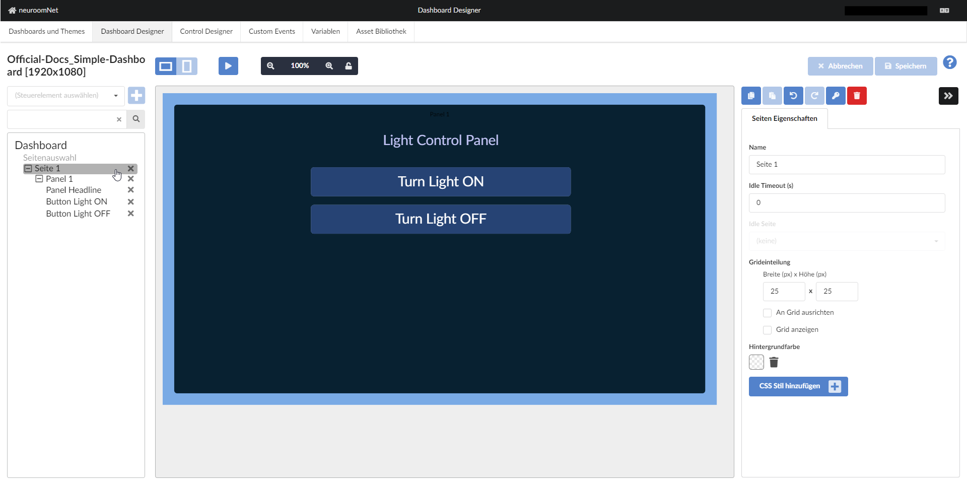
Idle Timeout (s)
An idle timeout in seconds can be specified per page. As long as the time is set to "0", no timeout is active. The page then remains open until a user navigates elsewhere.
If a time greater than 0 is set, the idle timeout is activated. When you open the page in the dashboard and this time expires without any interaction being detected, the dashboard automatically jumps to the selected idle page (Note: Only pages with a manually entered name appear in the combobox). The idle page could be, for example, a lock screen with PIN entry.
Grid Layout
As a design aid, a grid (raster) can be displayed. Snap to grid causes all elements added to the page to align to the grid lines. Show grid displays the grid.
The grid size can be changed as needed.
Background Colour and CSS Styles
The page can be given a background colour and custom CSS styles. The CSS styles are inherited further down (but can of course be overridden).
Settings for Panels
The following settings options are available for panels, in addition to the Heading field for manually naming the respective panel:
Corner Radius
With a corner radius of 0 pixels (px), the corners of the panel area are not rounded. Otherwise they are rounded with the corresponding length on the outer lines.
Left, Top, Width, Height
The position and dimensions of the panel within the respective page can be set using the coordinates of the upper left corner and width / height.
Grid Layout
As with the page settings, a grid can also be enabled and configured for panels.
Background Colour and CSS Styles
Like a page, a panel can also be given a background colour and custom CSS styles. The CSS styles are inherited further down (but can of course be overridden).
Themes and CSS Styling for Dashboards
The styling of controls and entire dashboards is technically based on so-called Cascading Style Sheets (CSS), see https://en.wikipedia.org/wiki/Cascading_Style_Sheets.
In the mini tutorial we had already used CSS styles to change colours.
Using themes, CSS styles (largely in the form of CSS variables, see especially Overview of available styles) can be centrally defined and applied, unless they are overridden by controls in the dashboard (or manually defined there). This can be practical for easily restyling an entire dashboard, but also has some limitations.