Mini Tutorial: Building a Simple Dashboard
The following mini tutorial demonstrates how to create a simple dashboard step by step. At least reading through the tutorial is strongly recommended. Hands-on practice is ideal (duration approx. 30 minutes), especially if you plan to create your own dashboards.
Step 1: Create a New Dashboard
To create a new dashboard, perform the following in the "Dashboards and Themes" tab:
- If necessary, click on "Add new dashboard" (if no dashboard is currently selected in the tab, you do not need to click the button)
- Enter a name for the dashboard (do not use whitespace or other characters that cannot be part of a web URL)
- Optional: Enter an author (free text)
- Optional: Enter a description in the Info field
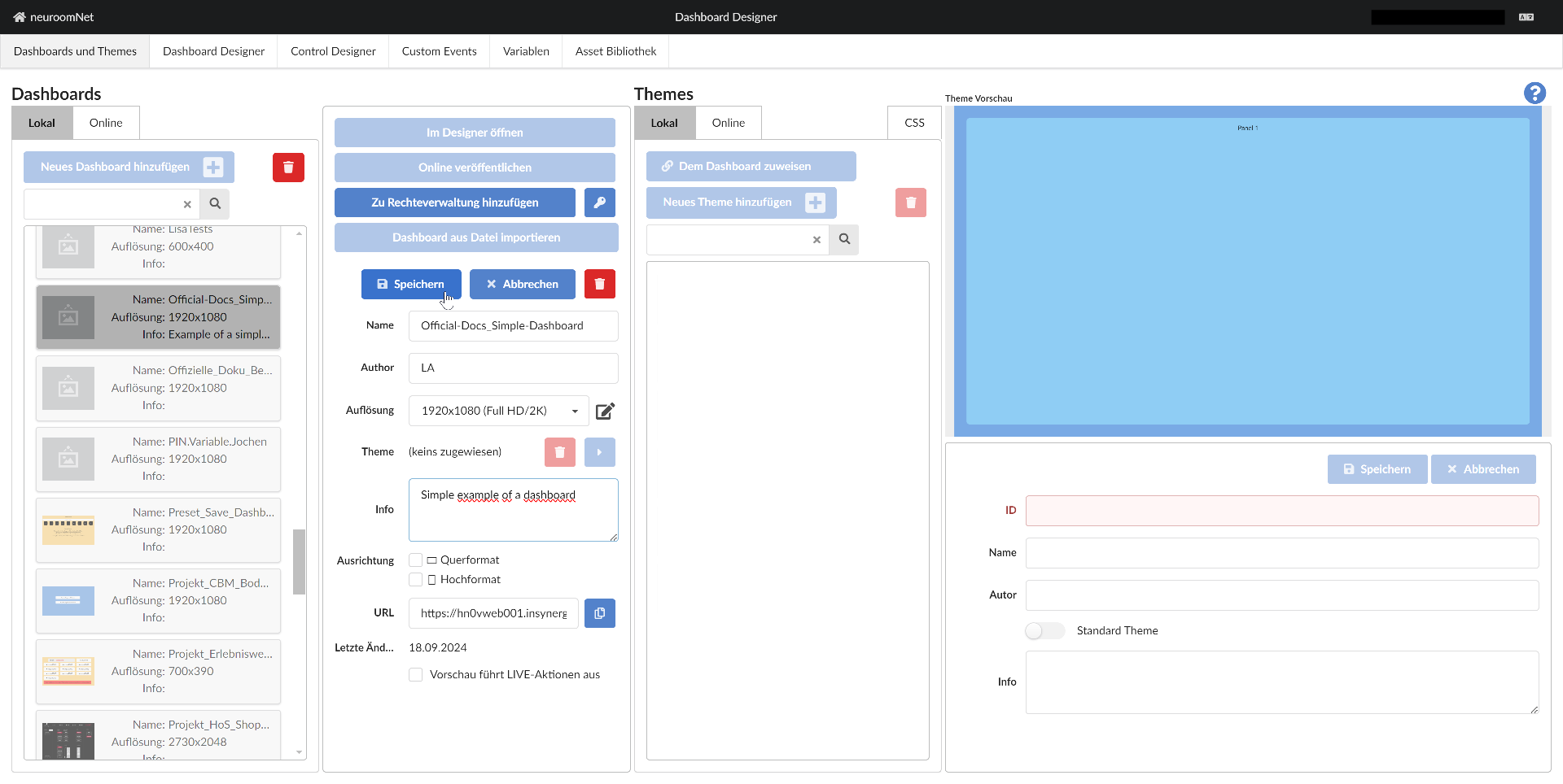
After clicking "Save" and clicking "Open in Designer", the dashboard opens in the Dashboard Designer:
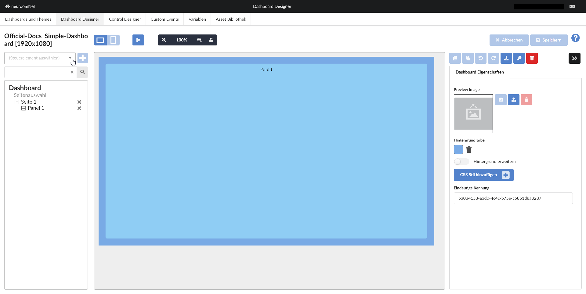
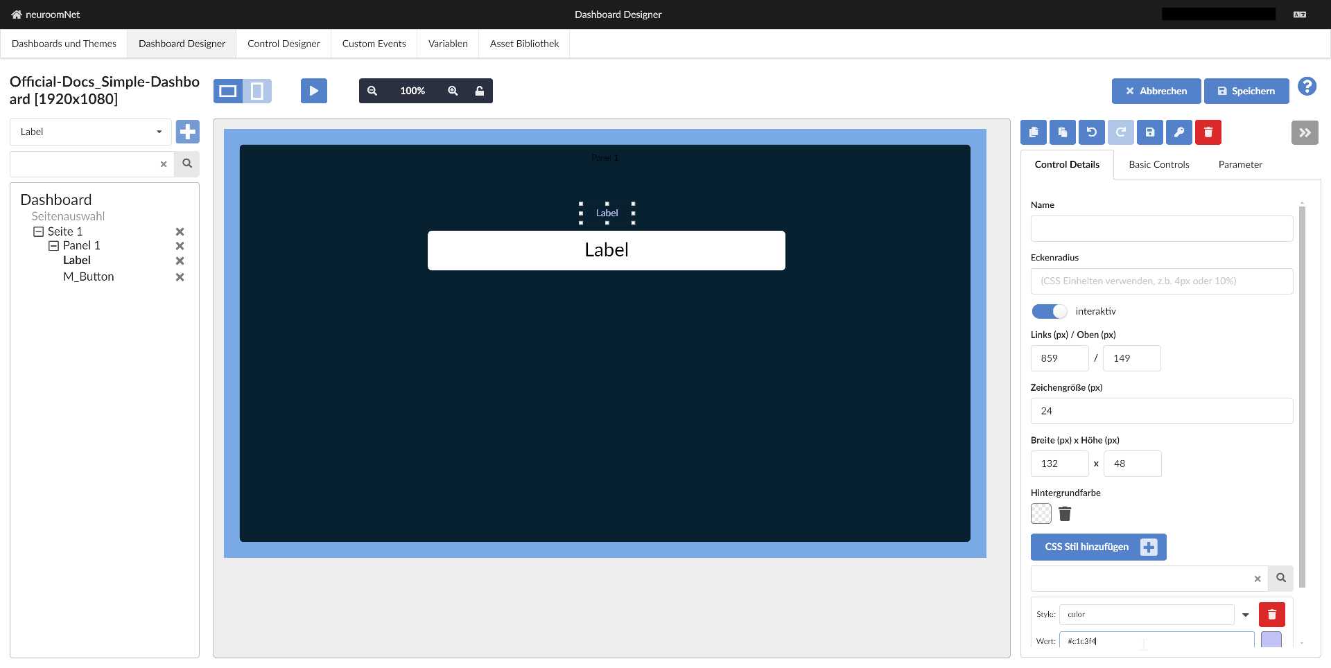
Step 2: Add a Label Control and Move It
Now we add a control of the type (more precisely, control template) "Label"1 as follows:
- Click on "Panel 1" in the left part so that this panel is selected (this determines which panel the control is added to)
- Click on the combobox to select a control (more precisely, a control template):
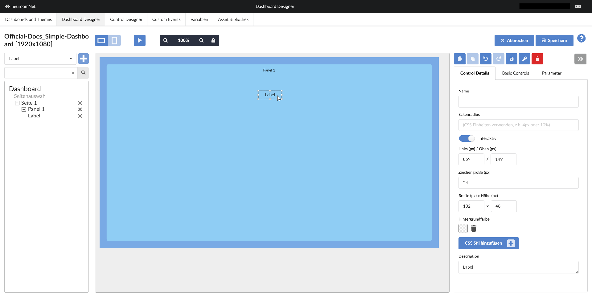
After selecting (clicking) the control template "Label" and clicking the plus button, the label has been added to Panel 1 of the dashboard:

Step 3: Move the Label
To give the dashboard a nicer design, we move the label a little using drag:

And drop:
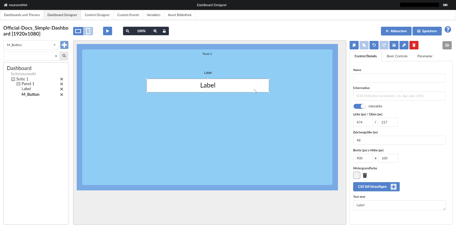
Step 4: Add Another Control
Analogously to steps 2 - 3, we add another control to the dashboard, more precisely to "Panel 1" - this time a control from the control template "M_Button"2 - and move it:
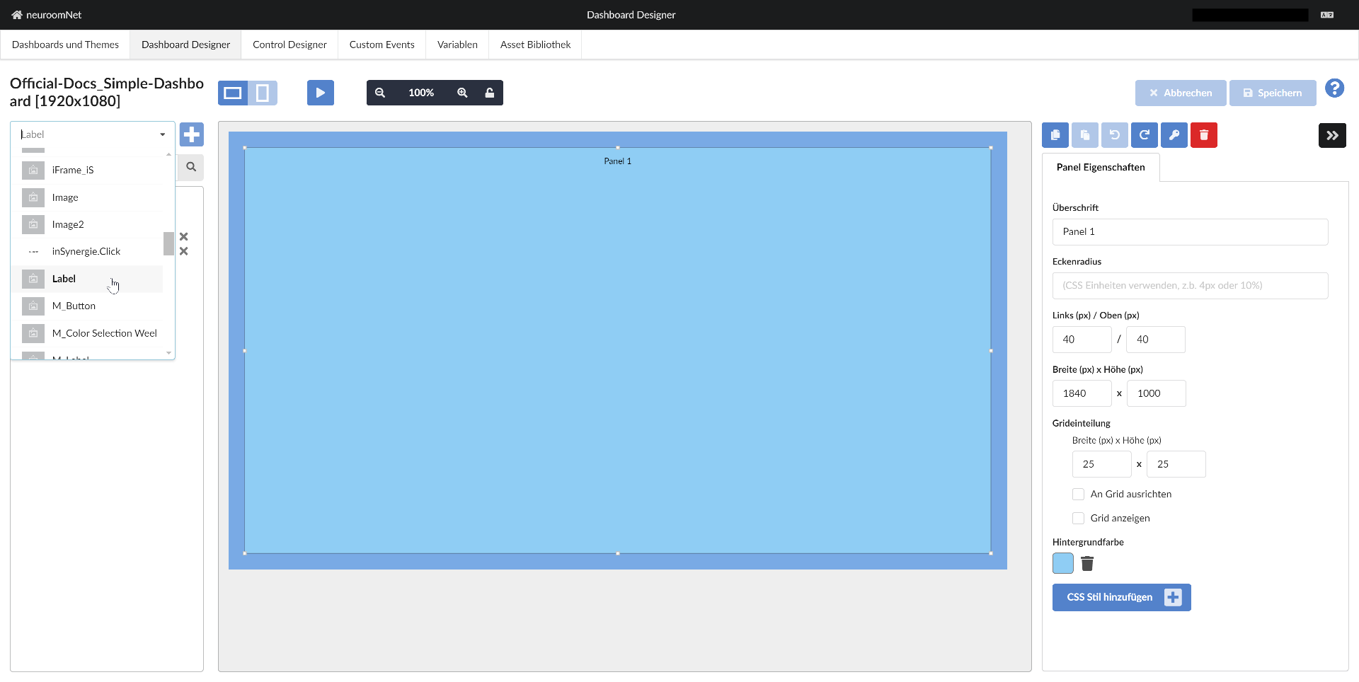
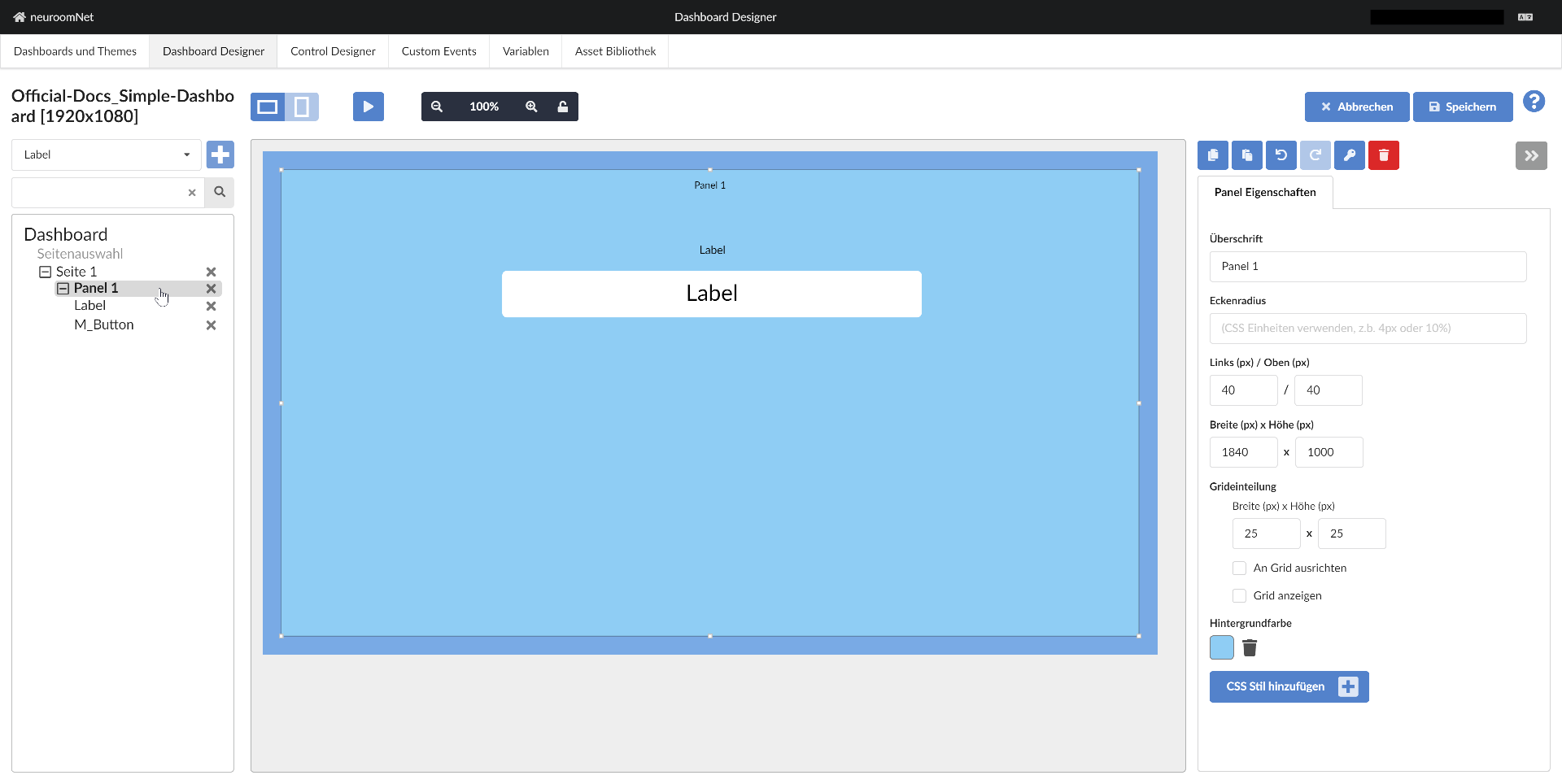
Step 5: Style the Panel by Changing Its Properties
Now we want to change the colour of the panel via its properties / "Control Details". To do this, click on the panel - either on the left in the structural view or on the right in the WYSIWYG display of the dashboard:
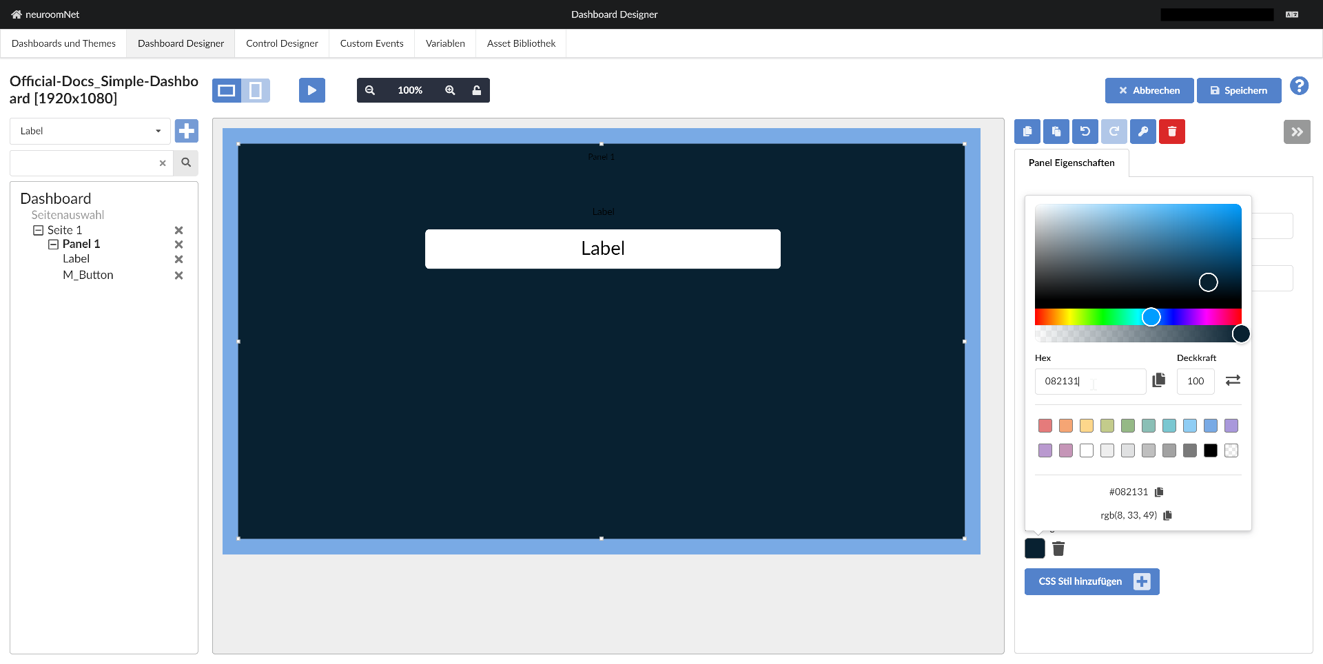
Now click on the colour field next to Background colour on the right and change the colour to a dark shade, such as 082131 (enter in the hex field):
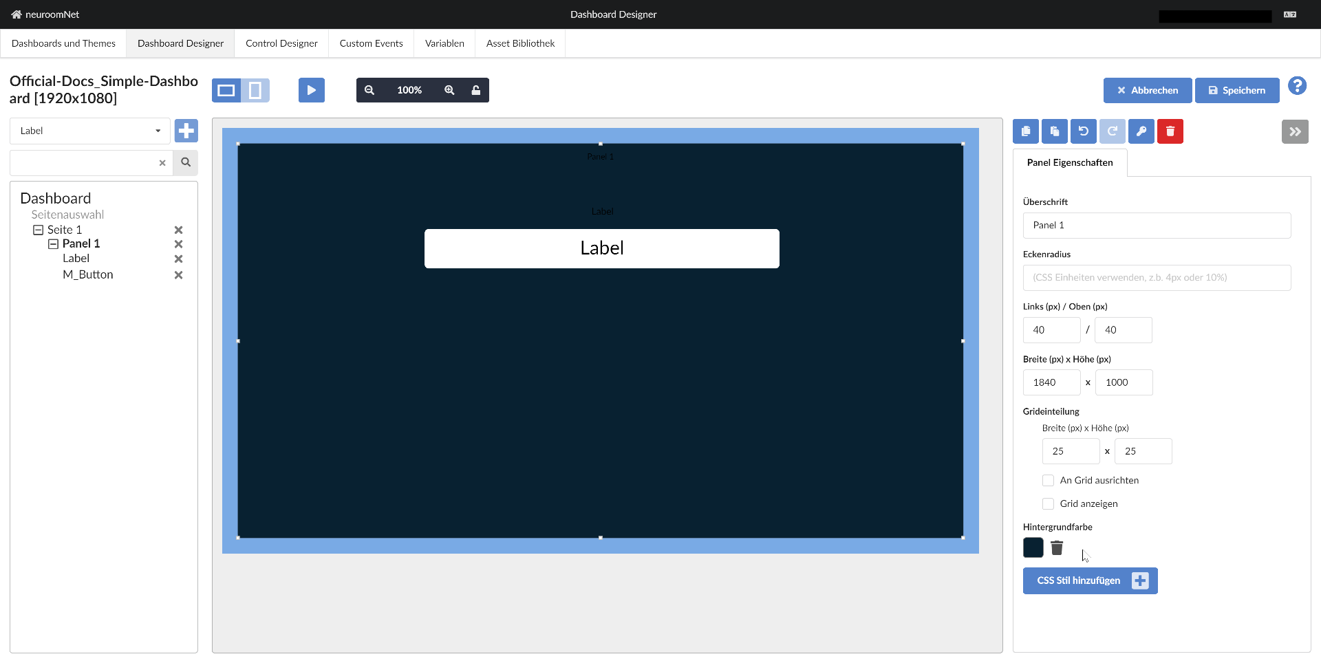
After clicking outside the popup / colour picker, the new colour is set accordingly:
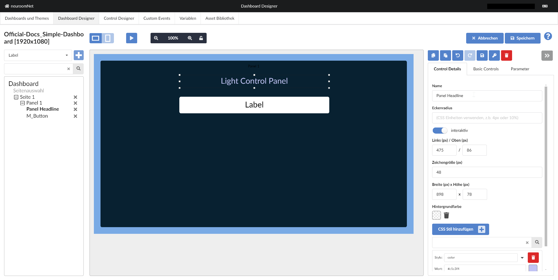
Step 6: Style the Label
Now we style the label and select it accordingly. Since the default black font colour (which could also come from an applied theme) is not visible against the dark background, we change the font colour by adding a new CSS style by:
- Clicking "Add CSS style"
- Selecting "color" in the "Style" combobox
- Selecting a colour value via colour picker or entering the colour value as a hexadecimal number:
#c1c3f4
Now we change the following for a better look:
- Change the font size to 48px
- Change the Description to "Light Control Panel"
- Move and resize the label using the mouse or the coordinate input fields
- Change the Name to "Panel Headline", so that the label now has this name in the structural overview on the left
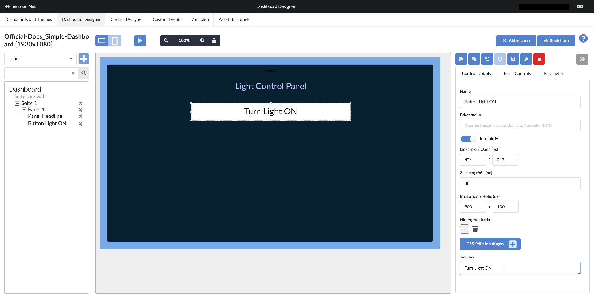
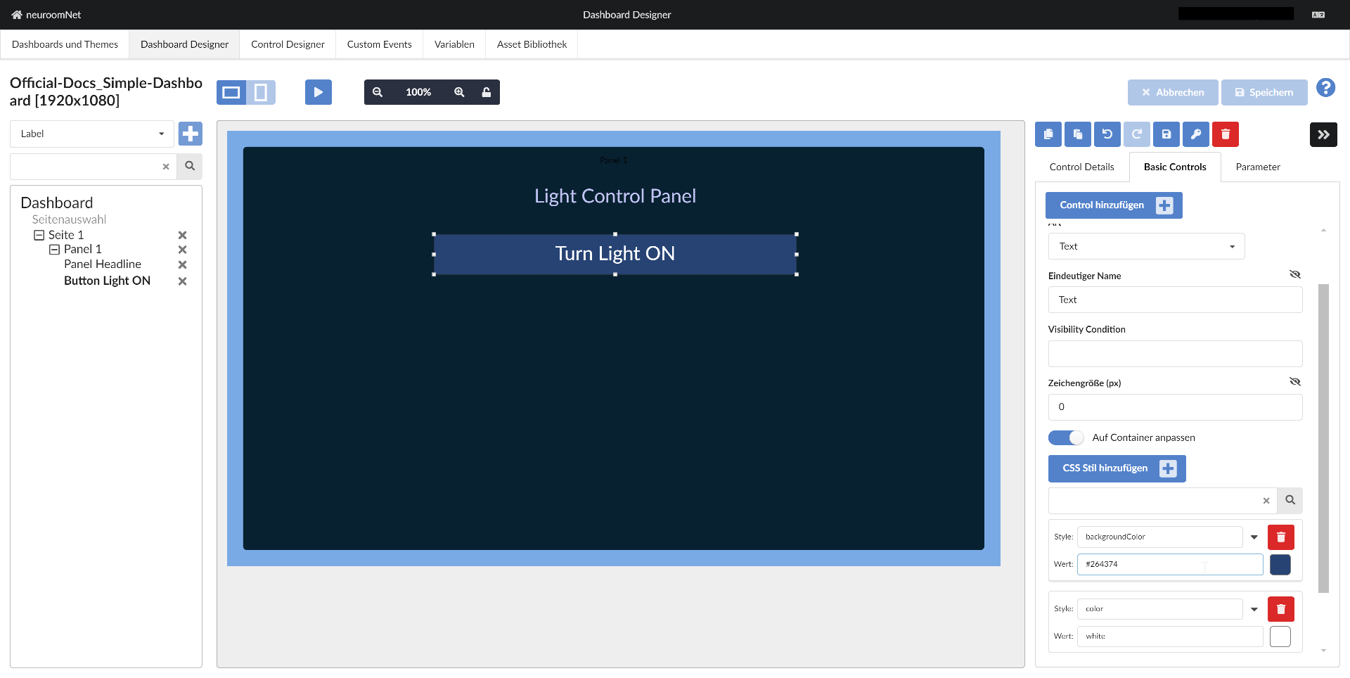
Step 7: Style the Button
For the structural overview, we first change:
- the Name of the button to "Button Light ON" and
- the Text to "Turn Light ON":
For further styling we need to switch to the sub / basic controls of the control, which for a normal button are:
- Button surface: This basic control represents the (normally invisible) surface that can respond to mouse click events (or touch events on touch displays)
- Text: This basic control is a label field, analogous to the previously inserted label (technically this label control consists only of a text basic control)
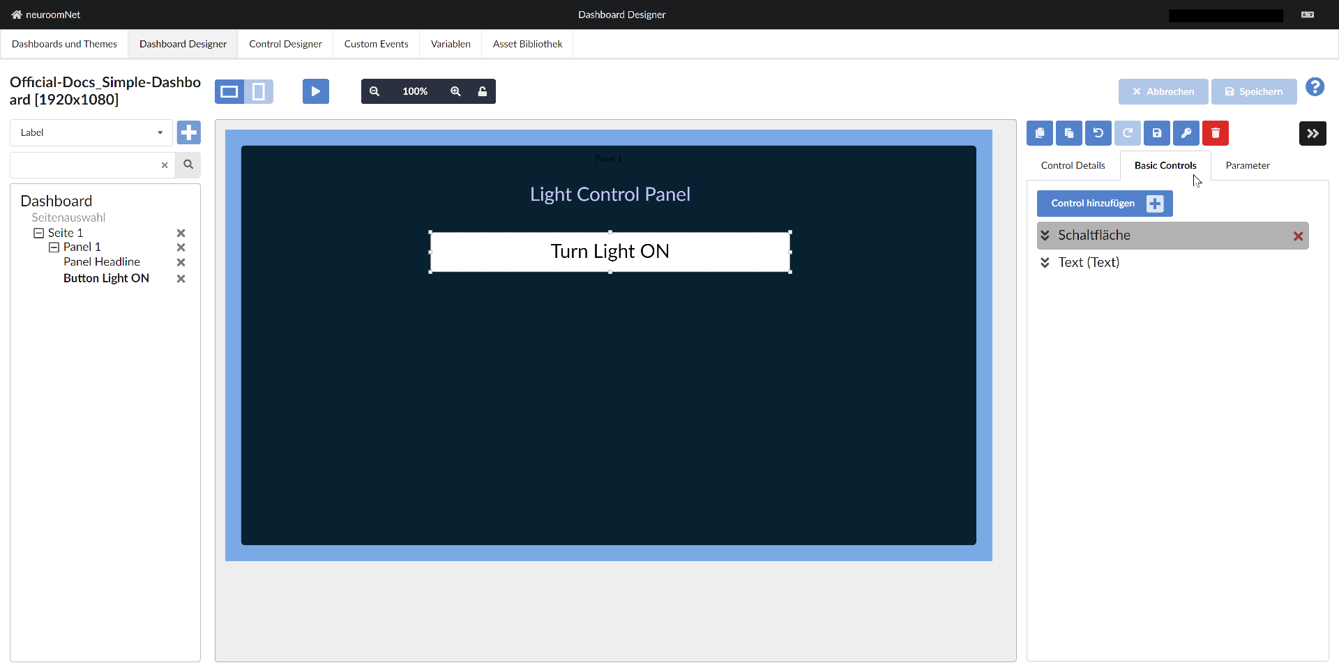
Technical note at this point: Because the Button surface basic control is higher up than the Text basic control, it is above the Text basic control (Z-order) and can therefore receive and process click events (i.e. it is not obscured by the other basic control).
To style the button, we style the Text basic control as follows:
- Add CSS style "color" with value "white"
- Add CSS style "backgroundColor" with value "#264374":
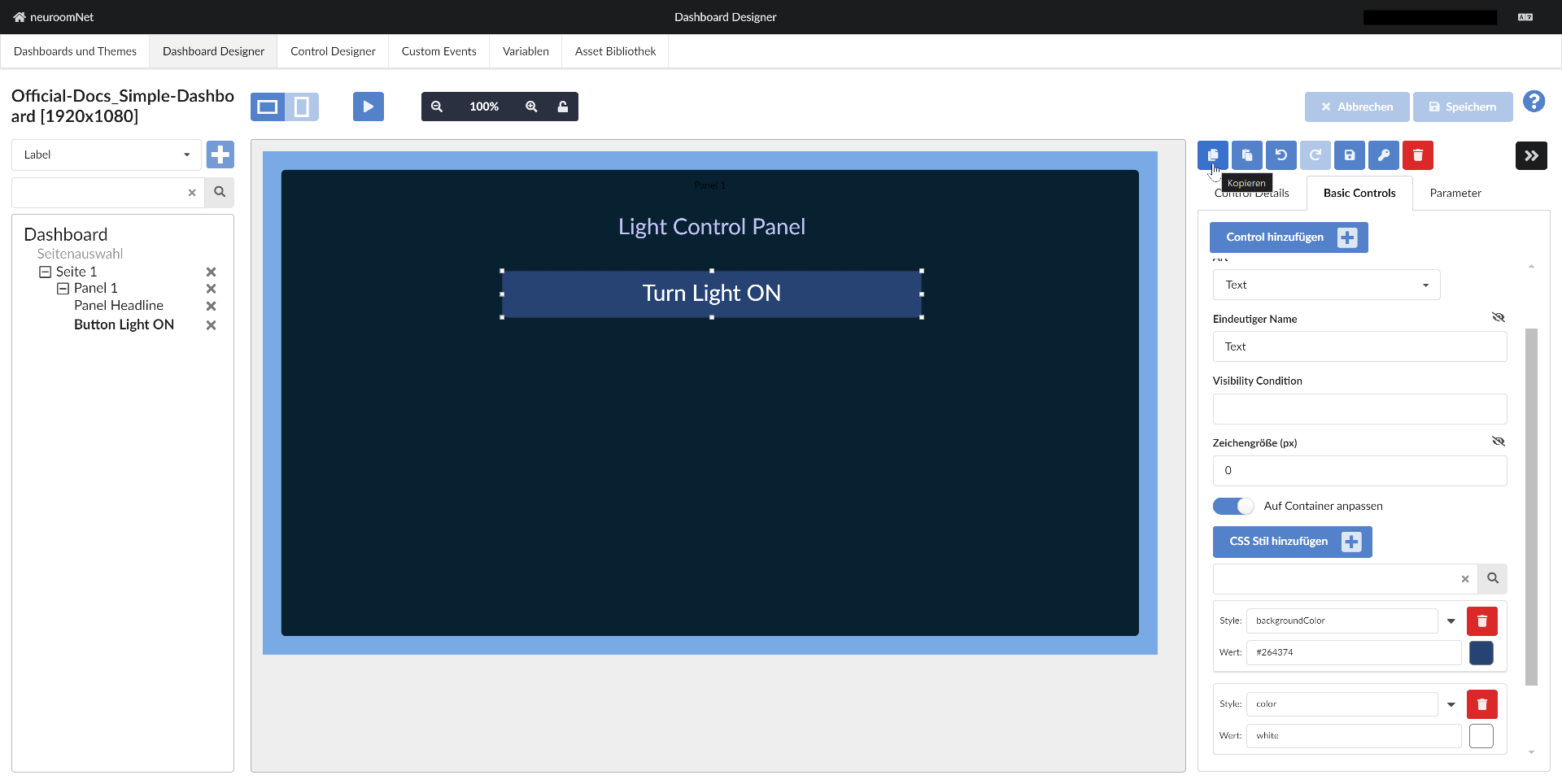
Step 8: Create Another Button via Copy & Paste
We copy the existing button by selecting the button and clicking the "Copy" button on the right above Control Details / Basic Controls:
Using the "Paste" button next to it, we insert a copy of the control:
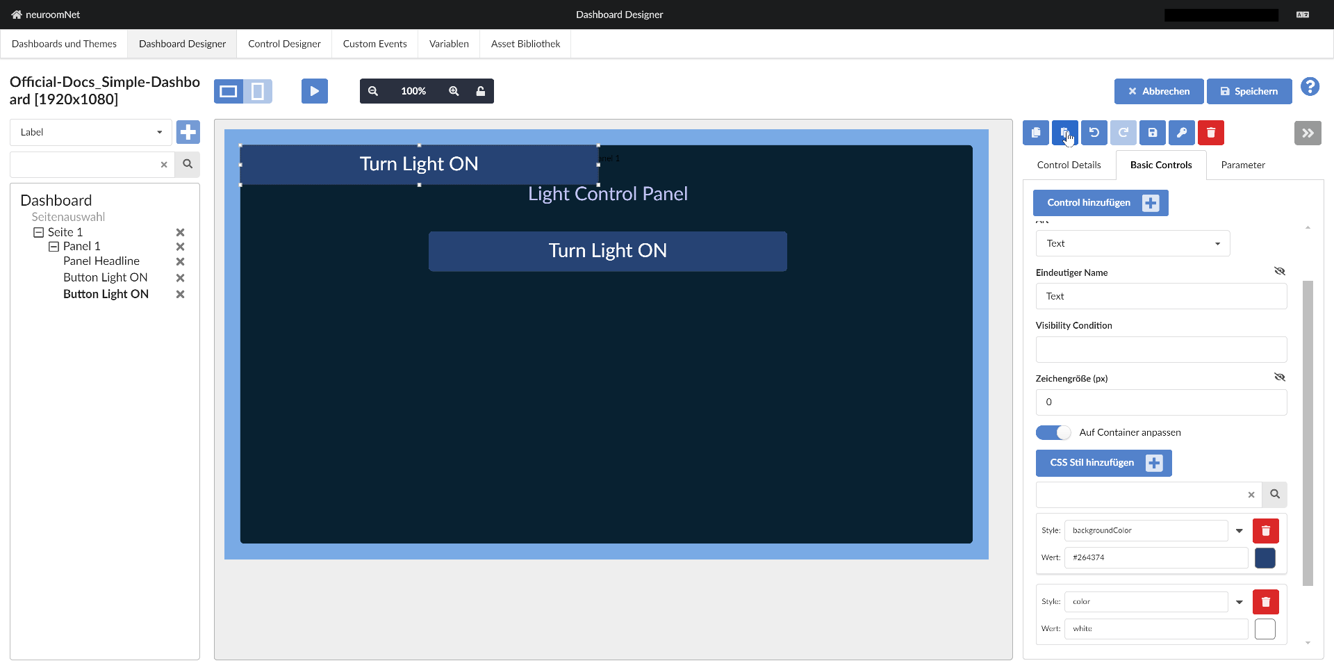
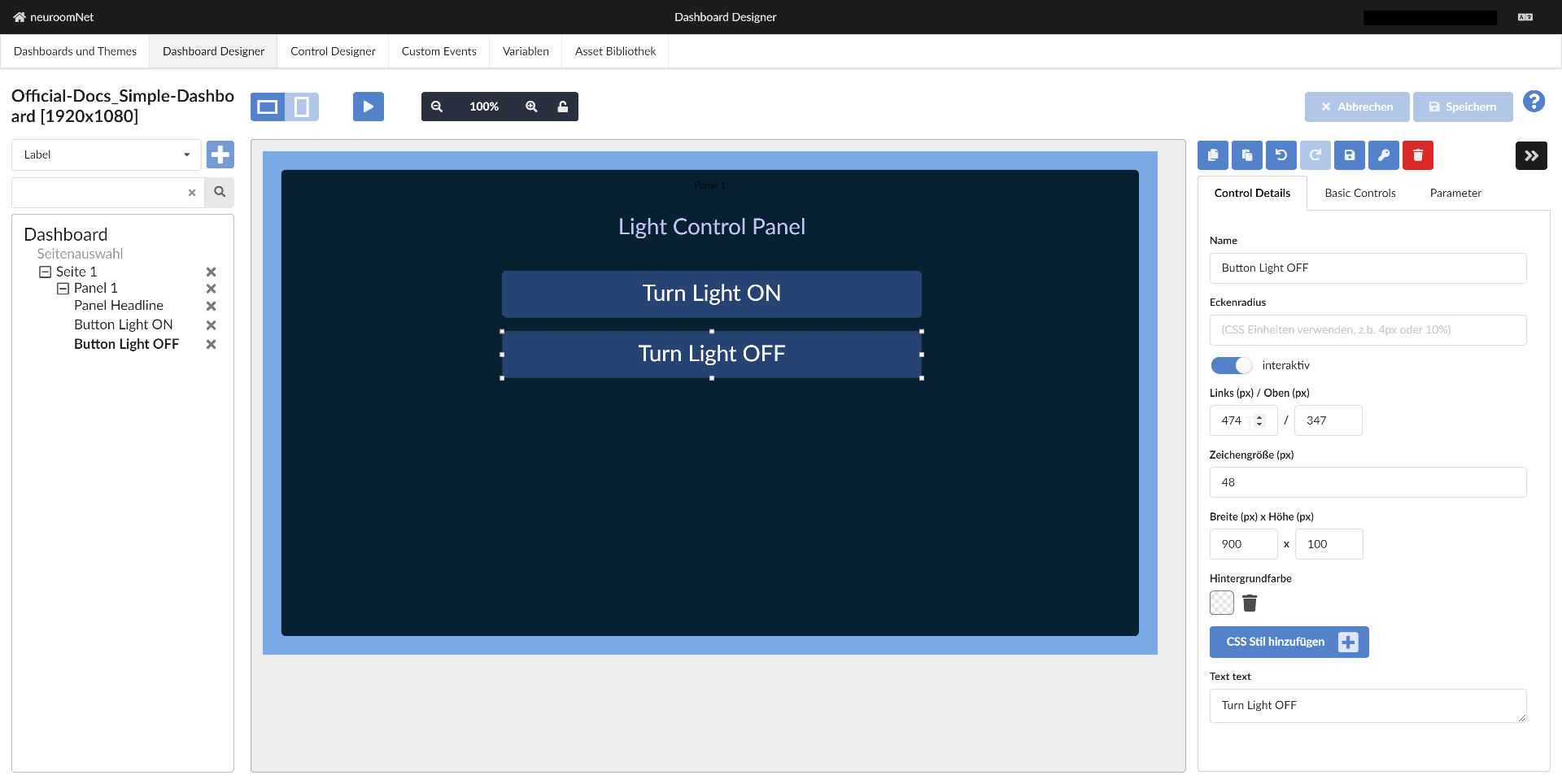
After repositioning (the coordinate inputs are useful for good alignment with other objects), renaming, and changing the text, we have our second button as it should be:
Tip: It is best to save the current state of the dashboard from time to time using the "Save" button at the top right.
Step 9: Add Functionality to the Buttons
Currently, 2 buttons are included in the dashboard, but clicking them does nothing yet. We change this by adding onClick event handlers for the button surfaces and calling a component action for each.
To do this, we first click the plus button at Events for the Button surface basic control of the first button and then click "onClick":
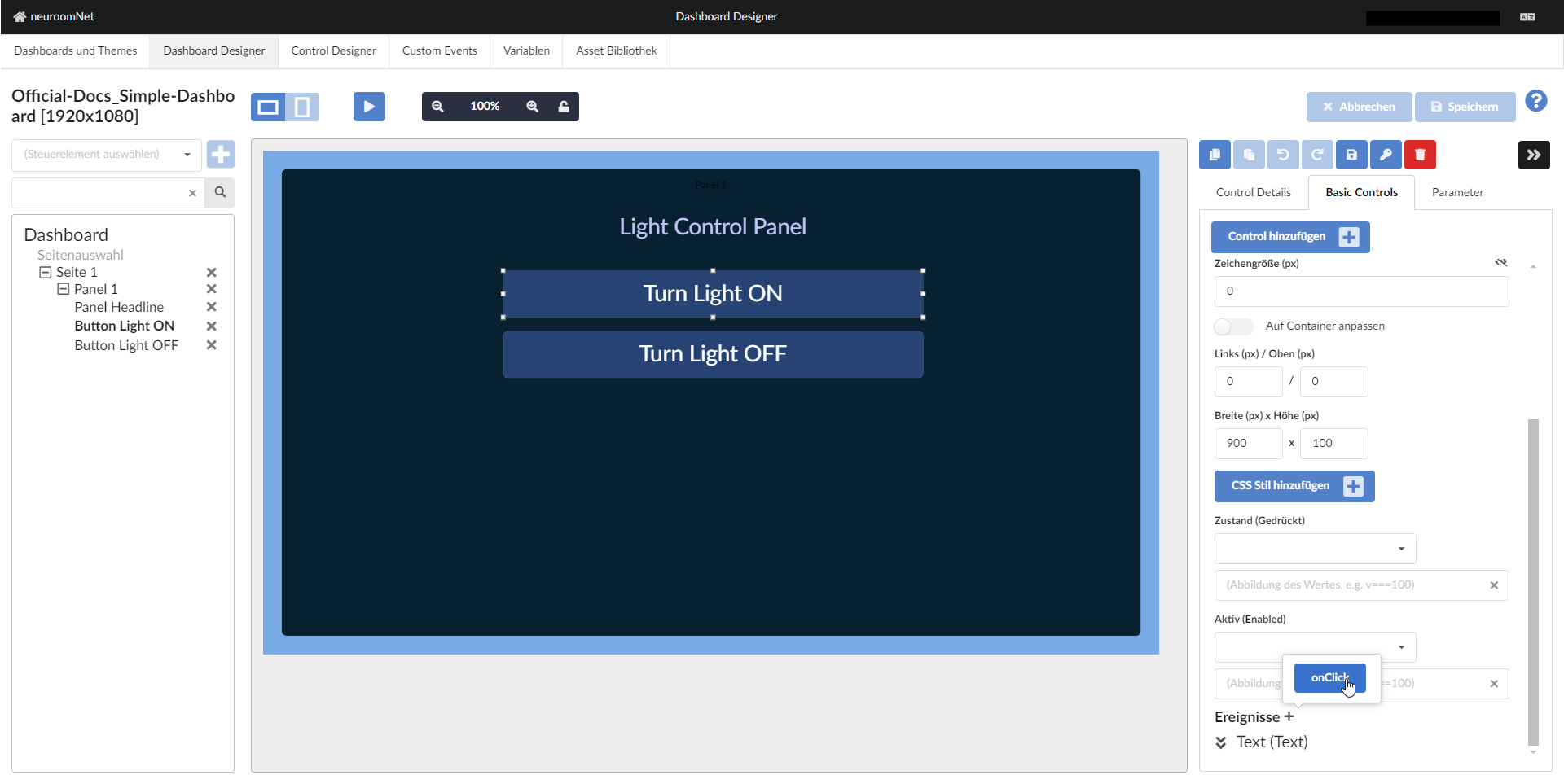
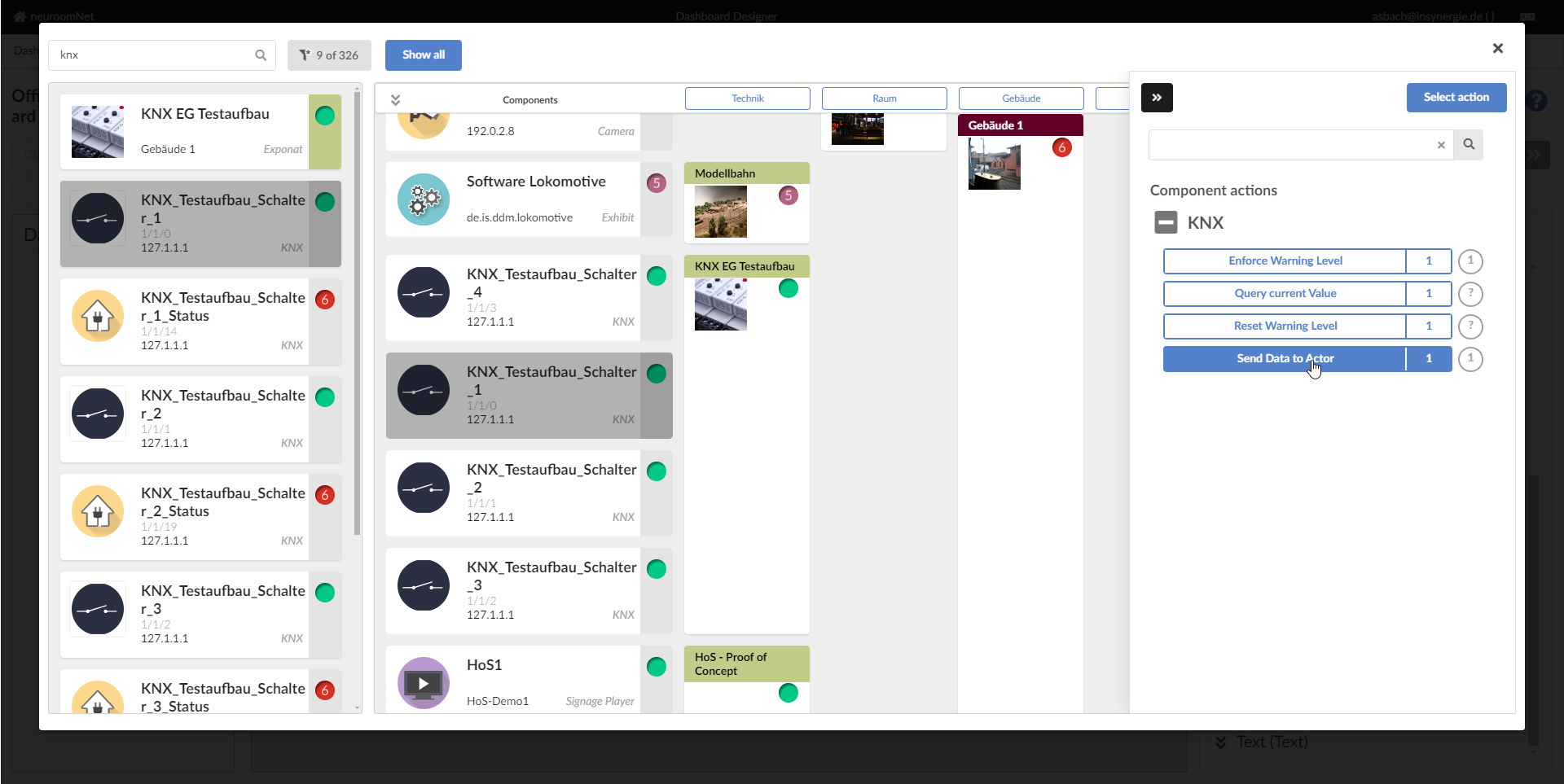
Then click on the combobox "(Select shared action)" and click "Component or Group Action" (this means a button click should execute a component / group action):

In the popup that appears, which is a variation of the hierarchy view of the Setup module, select a group or component and an associated action to be executed when the button is clicked3:
After confirming with "Select Action" at the top right, select the parameter value to be sent with the KNX action "Send data to actor" in this case when the button is clicked, and confirm with "Save" at the top right:
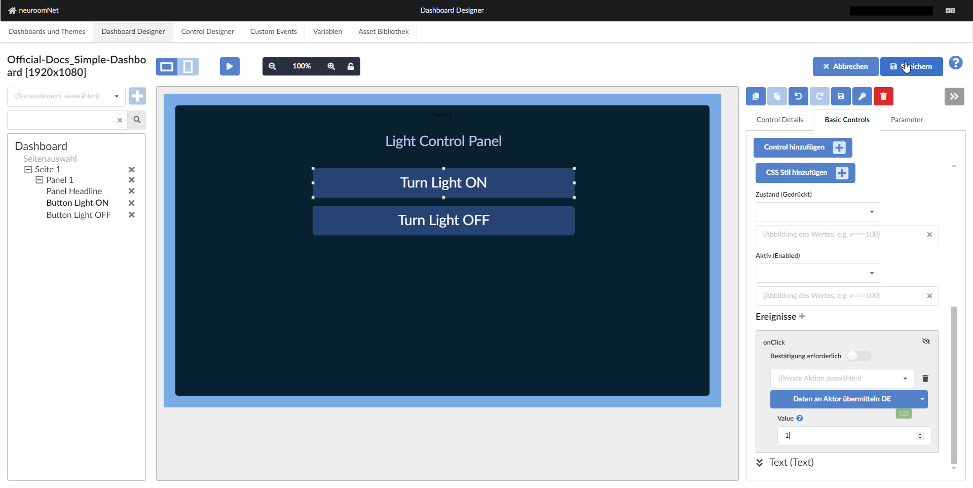
Do the same analogously for the "Turn Light OFF" button, but with parameter value 0.
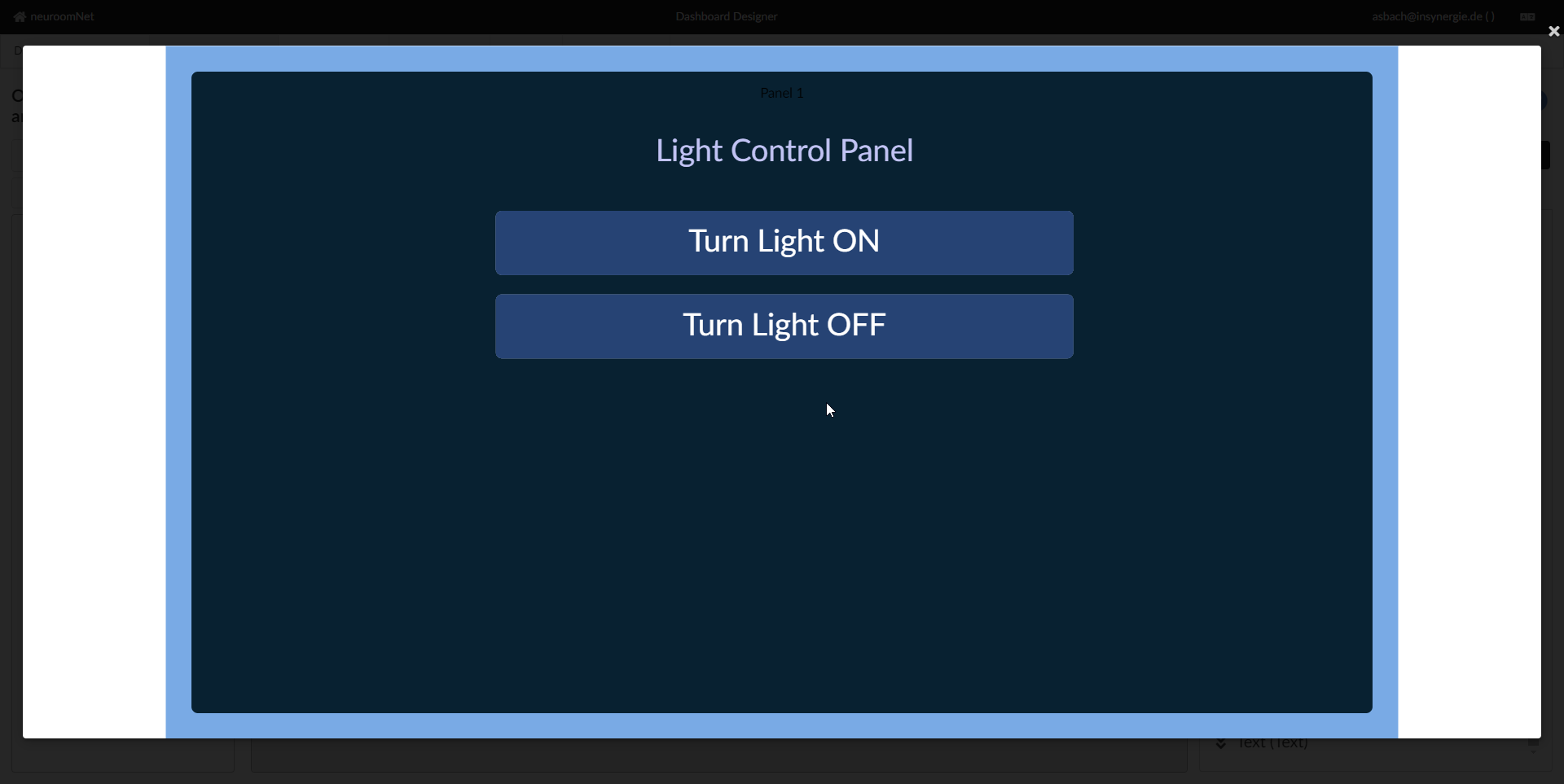
Step 10: Test the Dashboard in Play Mode
By clicking the play button, the dashboard can now be tested live:
Notes:
- Group and component actions are only executed in play mode if "Preview executes LIVE actions" is activated for this dashboard in the "Dashboards and Themes" tab
- Alternatively, the dashboard can now also be tested (make sure to "save" the dashboard first) under its actual URL
- To check sent actions, in addition to testing with the actual hardware devices, the Traffic Inspector can also be used
Step 11+: Further Possible Steps / Improvements to the Dashboard
Even though this dashboard is already fully functional, it can be further improved, for example by adding colour changes on mouse hover or when buttons are pressed. For these and further improvements see especially the following links:
- Notes on styling and reference documentation for CSS styles of basic controls
- (More advanced) Dashboard tutorials
- Concrete guides / best practices: