Hierarchy tab
This page has been automatically translated and has not been reviewed in detail yet. Therefore, the translation might not be completely accurate.

Change groupings
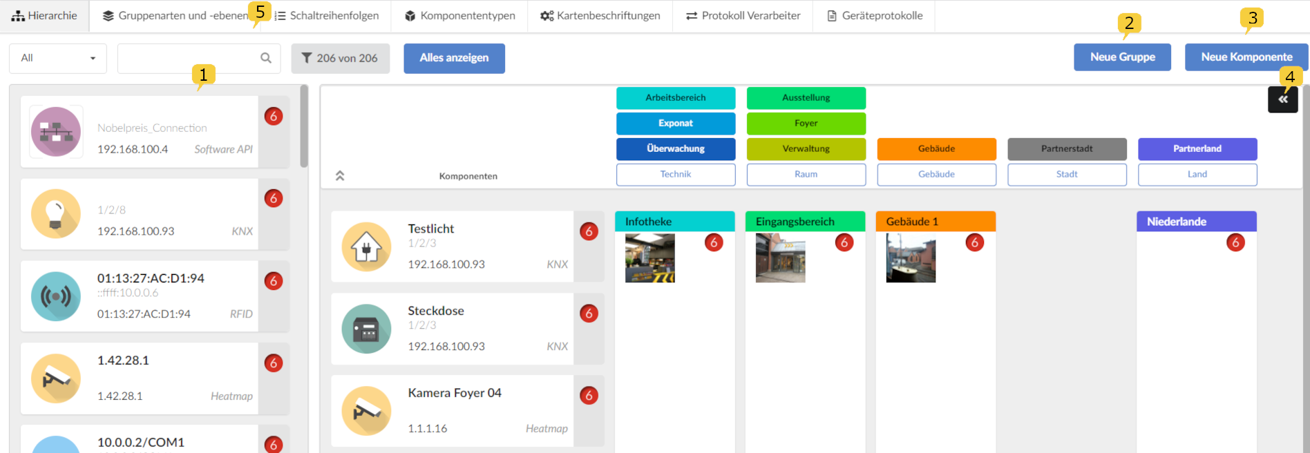
In the hierarchy view there is a list of the already created components 1, which can be assigned to the groups further to the right using drag & drop. The assigned components then appear in the second component list to the right. Groups can also be assigned to a parent group further to the right using drag & drop.
Components and subgroups can be removed from the groups by clicking on the following icons:
After clicking on the "New Group" button 2, a menu will appear.
Which information is requested in this menu can be specified under the "Group types and levels" 5 tab.
Creating a group

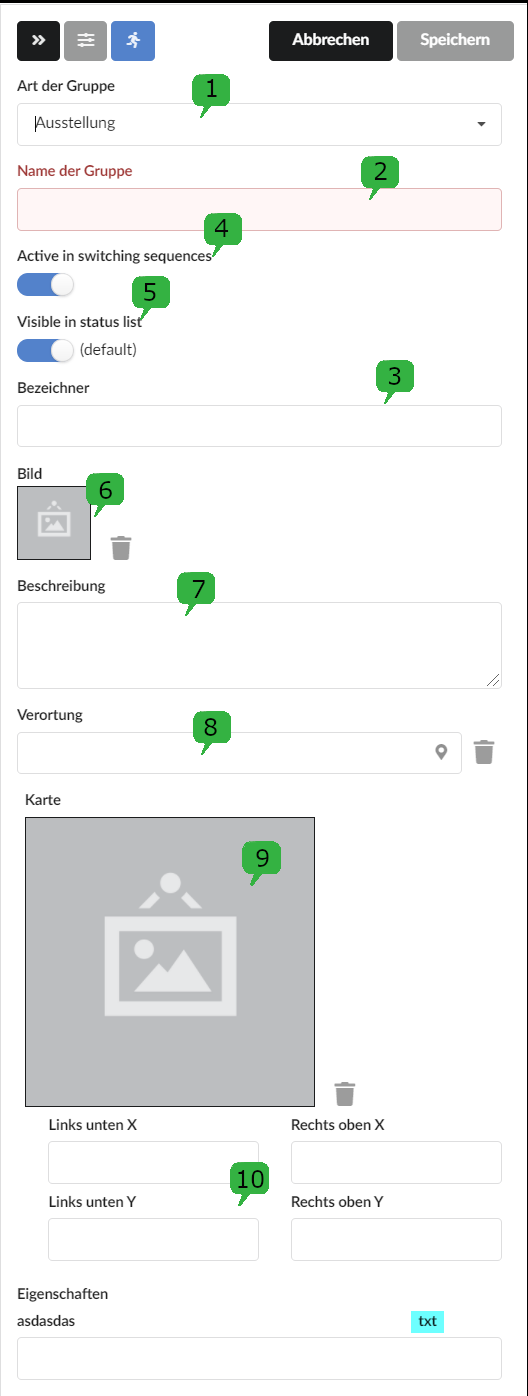
Here you can select the type of group 1 and assign a group name 2. The group type determines whether, for example, an entire exhibition, individual exhibits or the monitoring of the exhibition should be addressed together. More specific information can be stored under the identifier 3, for example an exhibit number.
If the group is not to be executed in the switching sequences, the “Active in switching sequences” 4 controller can be switched off. From NeuroomNet version 2023.1, the group will then be given a special deactivated status, marked by a white line.
The “Visible in status list” 5 controller is used to determine whether the group should be visible under monitoring in the status list and the site plan.
Operating instructions, data sheets or block diagrams can be uploaded under image 6. Further information can be provided under Description 7 and the location 8 can be stored in a site plan.
Calculate the location of a group from the positioned child groups:
After clicking on the "Map" field 9, the site plan can be uploaded.
If a site plan has changed, a reference is created with the coordinates 10. This information is generally not required.
Finally, the new group is saved.
Creating a component
Except for PCs that still require client software, new components should automatically register themselves in the network. If this has not happened, a similar component can be selected by clicking on the component and, after it is grayed out, copied with 1. Then only the information such as the MAC address needs to be changed.

Creating a component without a template is done using the “New Component” button 3.
The provider is first selected in the menu that appears (for an explanation of providers and an overview of all providers, see chapter Component types tab). Depending on the provider selected, the other required entries differ. At this point the warning level 2 can be changed. The default status is 0 for "OK" and 6 for "OFFLINE" or "FAIL".
Maintain warning levels

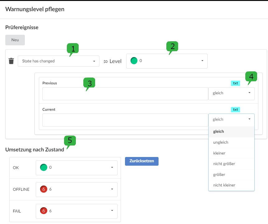
In addition to the states OK, OFFLINE and FAIL(5), component-specific properties 1 can also be checked. For example, warning levels 2 can be assigned for status changes 3. The current warning level is always the last one reported.
Conceptually, the levels range from
- 0: OK,
- 1: lowest warning level up to
- [...]
- 5: highest warning level and
- 6: Offline or Fail
Test events can be created for the warning levels.
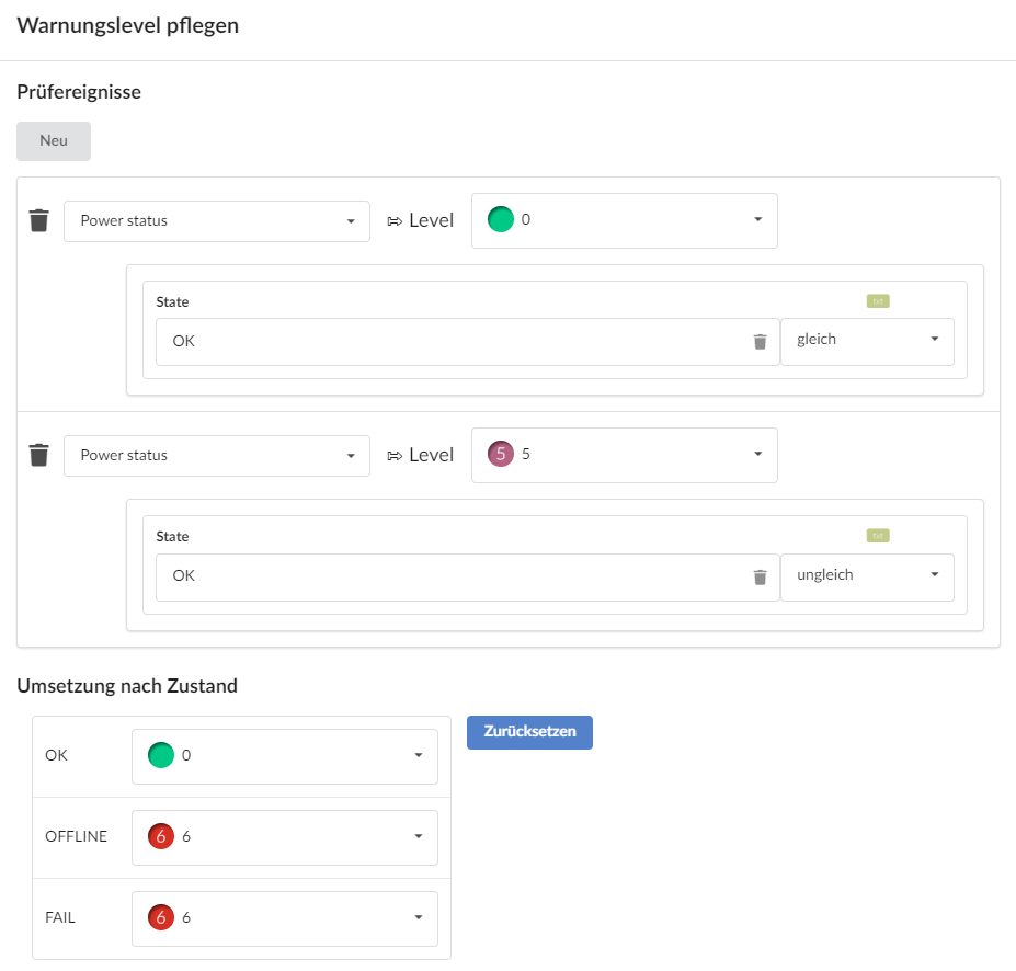
Using the example of a PJLink component for a projector, you could create test events for the power status and lamp hours and assign a desired warning level:


Triggering actions manually
In the event that groups or component actions should not be triggered automatically, for example via time control, but manually, there are the following options at point 4 (screenshot at the top). User interface:
- Show the right sidebar:
- Show description of the selected group or component (in the right sidebar):
- Execute actions and switching sequences for selected components and groups (in the right sidebar):
Before an action is triggered, a security query appears asking whether the action should be carried out irrevocably.