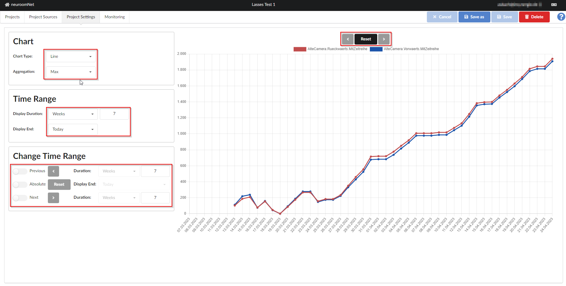
Project settings tab
This page has been automatically translated and has not been reviewed in detail yet. Therefore, the translation might not be completely accurate.
In the "Project Settings" tab you can set how and which parts of the time series selected in the previous tab are displayed on the screen and can also be exported to CSV using the export functionality):

Period and chart type
The time period to be displayed is defined under the time range:
- The right end of the period to be displayed is set under Display End (default: today)
- Under Display Duration, a unit is selected (minutes, hours, days, weeks, months, years) and then how many of these units should be displayed
The Display End and Display Duration ultimately result in the Display Start (visualized only in the x-axis of the graph as the point in time furthest to the left). The statistics project then ultimately shows values between Display Start and Display End.
The selection of the display duration also influences the x-axis and aggregation of data points (see below) as follows:
- If you select minutes, the time series values are displayed per minute
- If you select hours, the time series values are displayed per hour
- When days, weeks, months or years are selected, the time series values are displayed per day
In the example image, see above, the last 7 weeks of data from the two selected time series (2 counters from a test camera that was set up, which counts people walking past and whose counters were partially reset) are displayed.
The display type is selected under Diagram:
- With Chart Type you can choose between line and bar charts
- Aggregation determines which value is displayed on the y-axis if there are several data sets in the time series:
- Min: Shows the minimum value in the data records for the aggregated period
- Max: Shows the maximum value in the data records for the aggregated period
- Average: Shows the average value in the data records for the aggregated period
- Count: Shows the number of existing data records in the aggregated period
- Sum: Displays the sum of the values of the records in the aggregated period.
Which type of aggregation makes sense depends heavily on the type of data in the time series.
Example of the aggregation types
In the example project, the value 1007 is displayed on April 7th, 2023 for the time series AlteCamera.Rueckwaerts.MitZeitserie:

Because "Weeks" was selected as the display duration, all time series values are aggregated to complete days. In this example, the camera ran permanently that day and one data set was written to the time series every minute. Using the selected aggregation type "Max", the highest value of all 1440 data sets (60 minutes * 24 hours) that were written on April 7, 2023 was selected for display for April 7, 2023.
The aggregation type "Count" makes sense, for example, if you want to show how frequently certain measurements were taken (and these don't take place every minute anyway, for example). "Sum" makes sense, for example, if written data represents deltas of how a value changes (by summing up these deltas you get the total value).
Browse data (change time range)
Finally, in the “Browse through data” (Change Time Range) section you can set how the buttons “<”, “Reset” and “>” in the middle above the diagram should work:
- "Previous" sets the period of time that should be scrolled back when you click the "<" button if this button is to be active
- With Reset you set where the display should be reset to when you click the "Reset" button, if this button should be active
- "Next" sets the period of time that should be scrolled forward when clicking the ">" button, if this button is to be active.