Dashboard Example / How-To: Creating a control that automatically changes its appearance and, if necessary, behavior depending on the values of global variables
This page has been automatically translated and has not been reviewed in detail yet. Therefore, the translation might not be completely accurate.
Introduction
Out of the box, the standard controls / templates in the dashboard are already very powerful. However, there are cases where simply using the controls is enough to create a functional dashboard, but there are visual requirements that require a control to look or behave differently depending on the value of a global variable.
This can be achieved as follows: For each required visual expression of a control, you create appropriately styled copies of the sub-controls and another sub-control of the "switch" type. The sub-control of the switch type then uses a Javascript formula and correspondingly bound global variables to determine whether the associated sub-controls should be displayed. In the latter, appropriate visibility conditions ensure display or non-display.
Since hardly anyone will understand this straight away, this concept will be explained in this chapter using a simpler example: Creating a button that has different background and text colors depending on whether a Boolean global variable has the value true or false.
Description example scenario/requirement
Suppose you have an audio DSP whose sound output channel can be muted and there should be a button in a dashboard that works and looks like this:
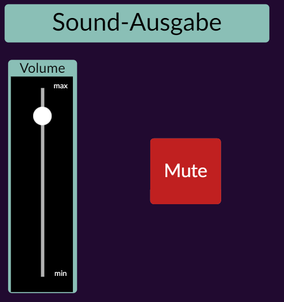
- If the sound output of the Audio DPS is currently muted, then the button should appear with a red background and white text "Mute":
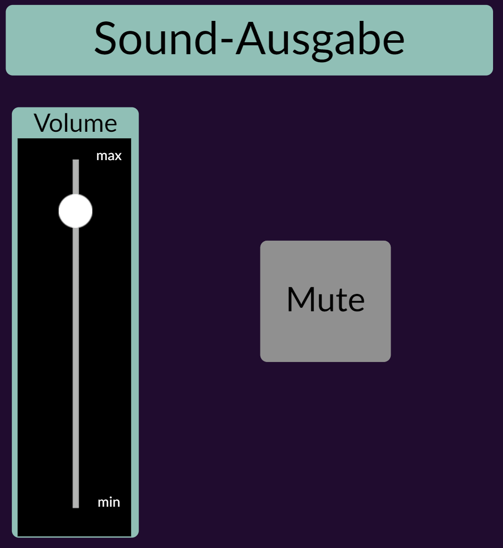
- If the sound output of the audio DSP is currently not muted, then the button should appear with a dark gray background and black text "Mute":
- In both cases, clicking the button should reverse the mute state, i.e. the audio DSP should either be muted or not muted.
Solution / How-To
The button described above can be implemented as follows:
Step 1: Adding M_Button
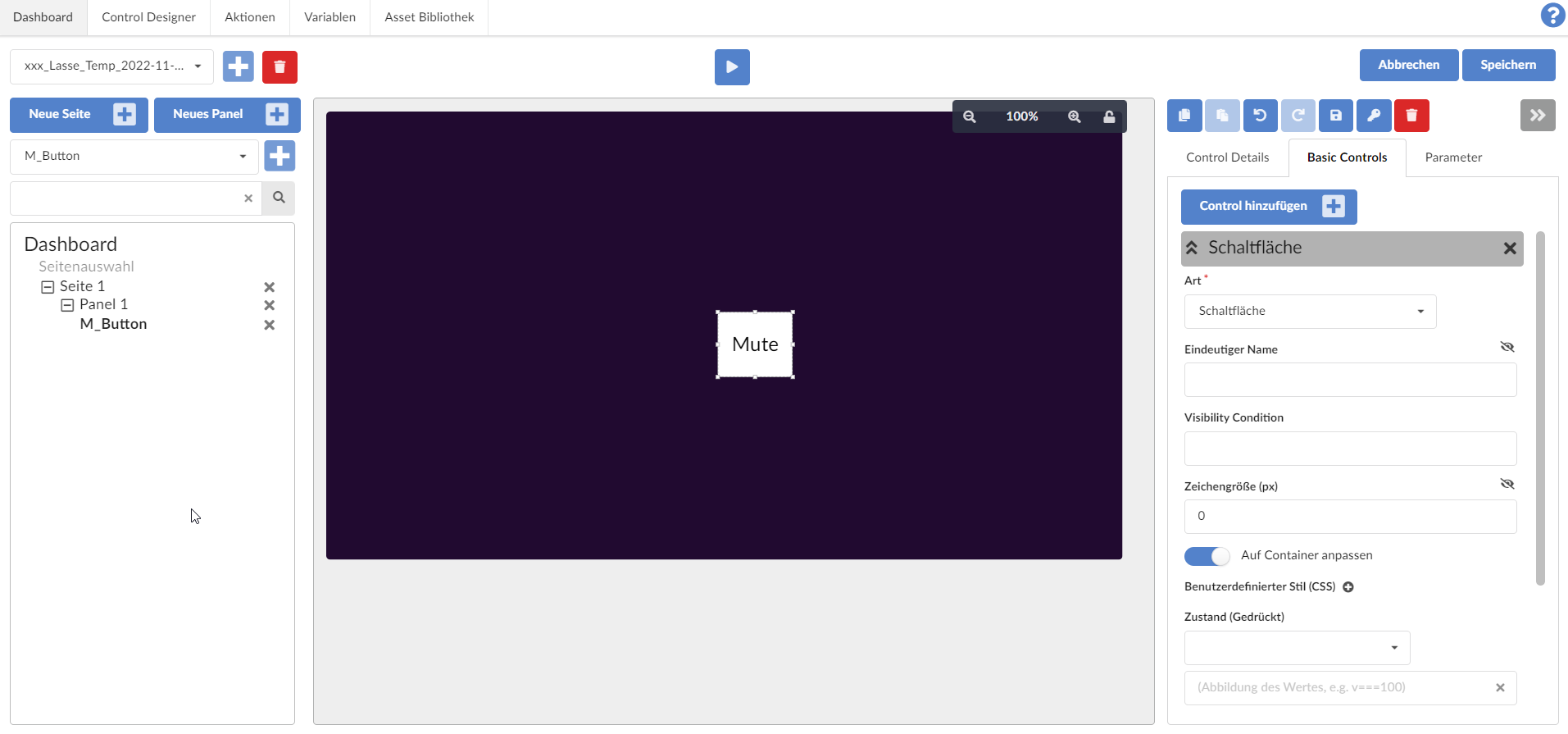
We add an ordinary M_Button to the panel,
- Position and adjust size as needed,
- Change the "Label" of the sub-control "Text" to "Mute" and
- Set the "Adapt to Container" flag for the "Button" sub-control:
Step 2: Rename the sub-controls
For a better overview, we rename the sub-controls as follows:
- "Button" after "Button_Mute_On"
- "Text" after "Text_Mute_On"
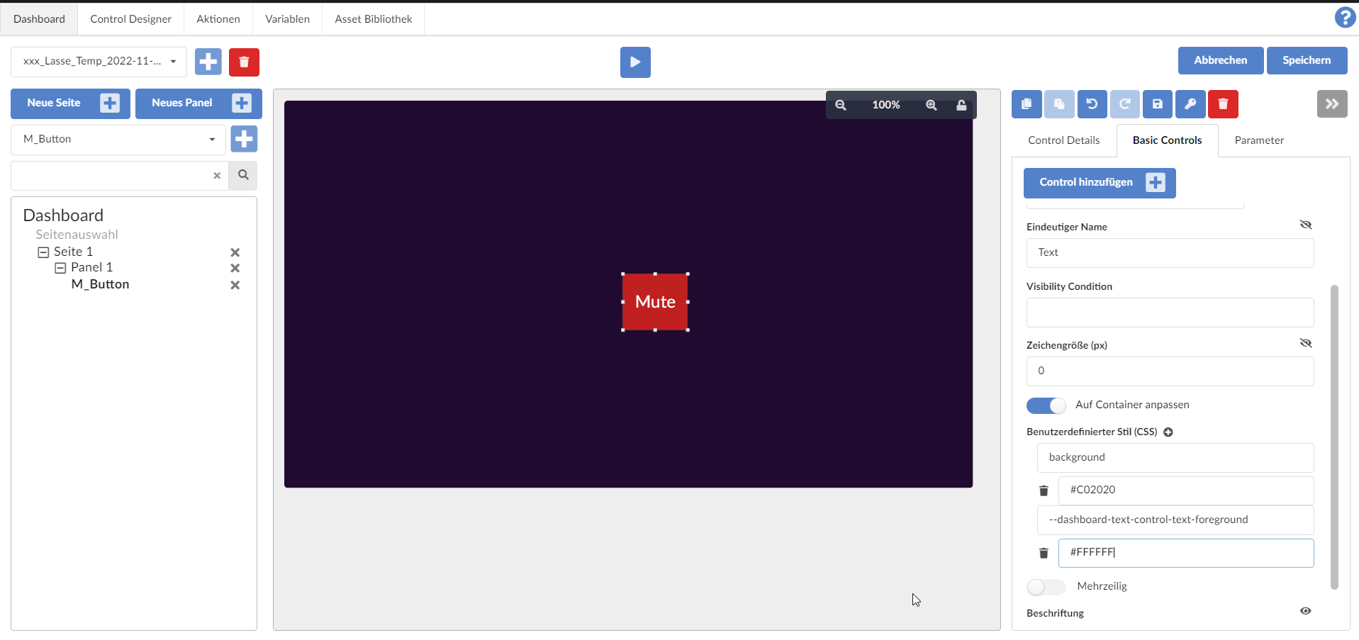
Step 3: Styling the button for the “mute on” case
We style the button for the "Mute on" case by adding the following CSS styles for the "Text_Mute_On" sub-control:
- background with value #C02020 (color red)
- --dashboard-text-control-text-foreground with value #FFFFFF (color white)
Step 4: Add new subcontrols "Text" and "Button" and rename them
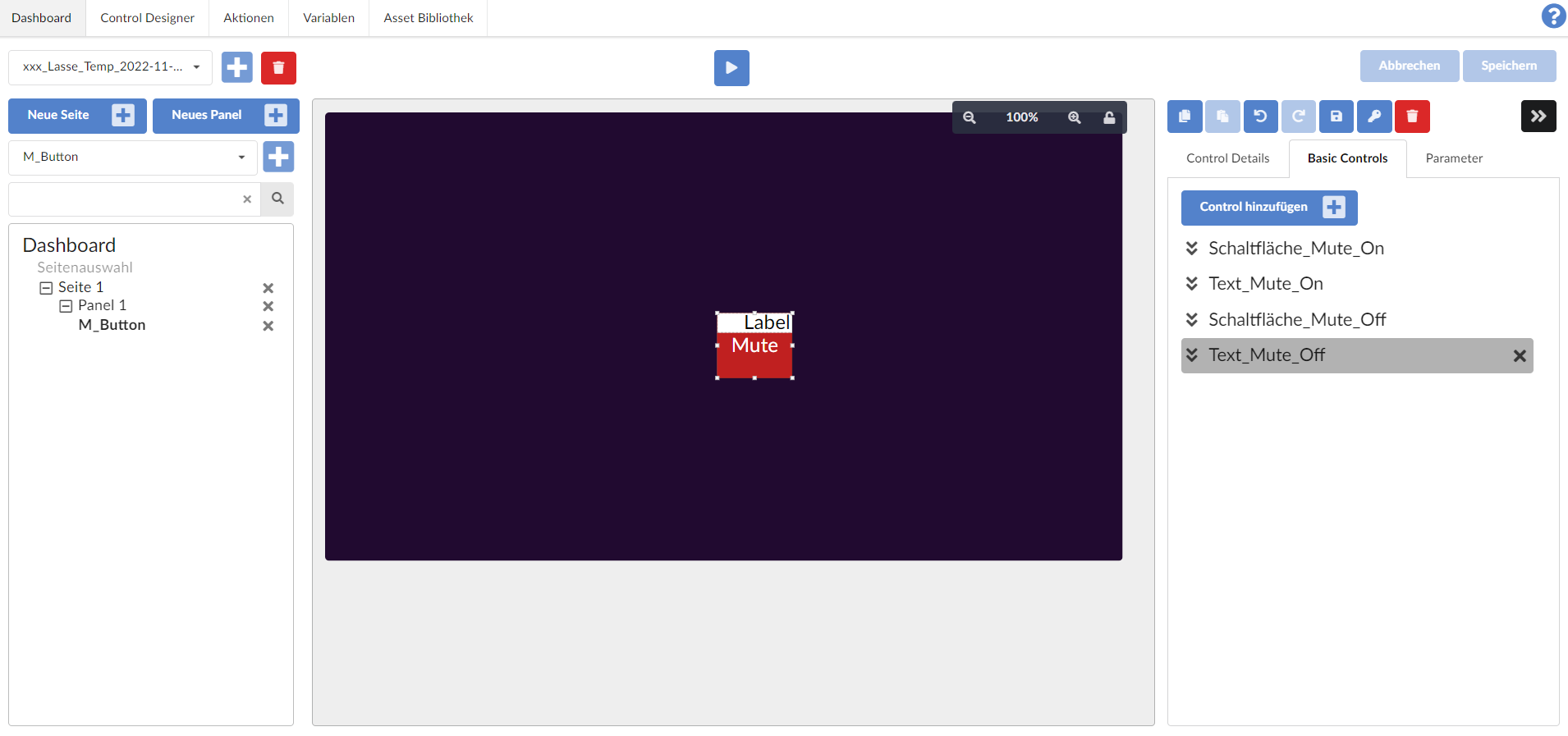
Now we add 2 new subcontrols and name them as follows:
- Of type "Text" and name it "Text_Mute_Off"
- Of type "Button" and name it "Button_Mute_Off":
Step 5: Styling the sub-controls "Text_Mute_Off" and "Button_Mute_Off"
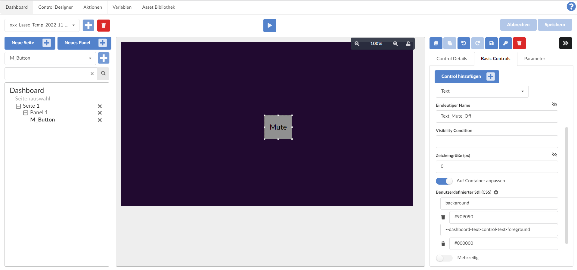
Now we style the two new controls for the “Mute Off” case
- Set the flag for “Adapt to container” for both sub-controls
- Set "Text_Mute_Off" in the sub-control
- Label: "Mute"
- Add CSS style background with value #909090 (color gray)
- Add CSS style --dashboard-text-control-text-foreground with value #000000 (color black)
Because the two subcontrols were created in the "Basic Control" view under the controls "Button_Mute_On" and "Button_Mute_Off" and are therefore rendered above them, so to speak, we can immediately see the result of the styling:
Step 6: Adding an internal switch
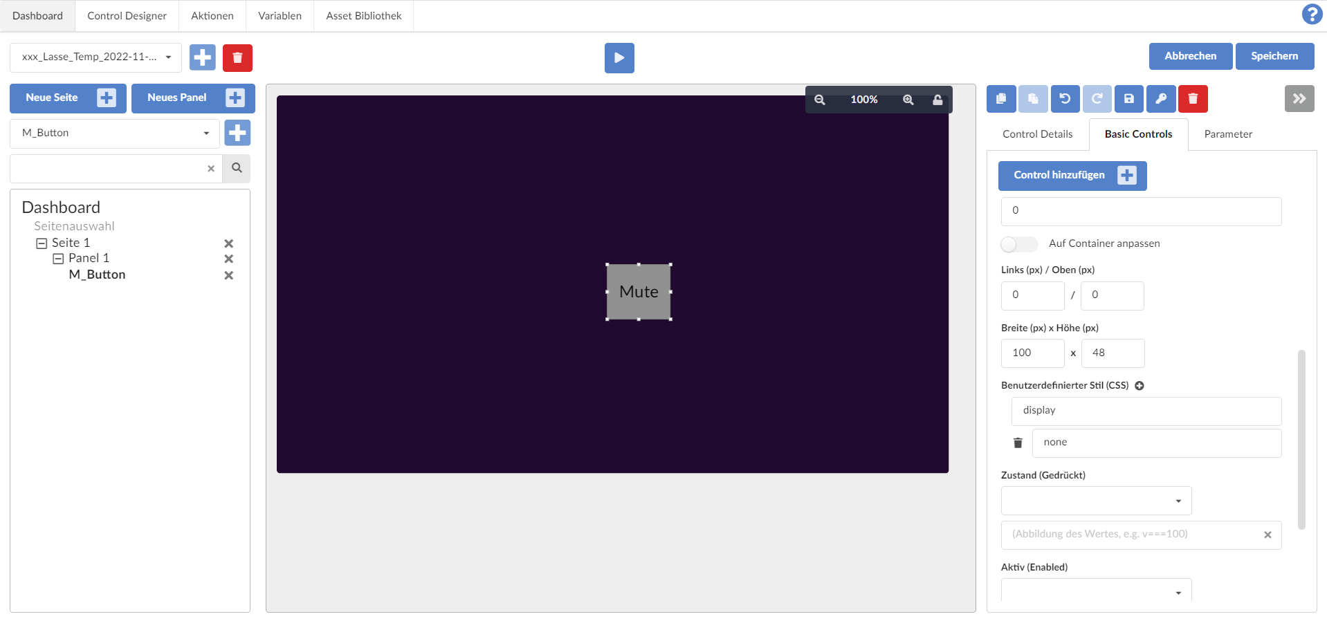
Now we add a sub-control of the type "Switch", which we will later link to a global variable: Internal_Switch_Mute_On

Here we set the CSS style “display” with the value “none” so that this switch is not visible:
Step 7: Link the main control to a global variable
To do this, we add a corresponding binding “bindingAudioDspMute” with a Boolean, global variable “AudioDSPMute1” via the “Parameters” tab on the right:
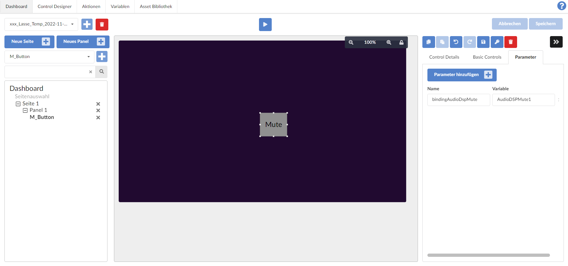
With this addition, the global variable can later be referenced in expressions within the control via the binding and thus used.
Step 8: Link the switch to the global variable
Now we want to implement the following:
The Internal_Schalter_Mute_On switch should be "active" if and only if the AuditoDSPMute1 variable or the binding is true.
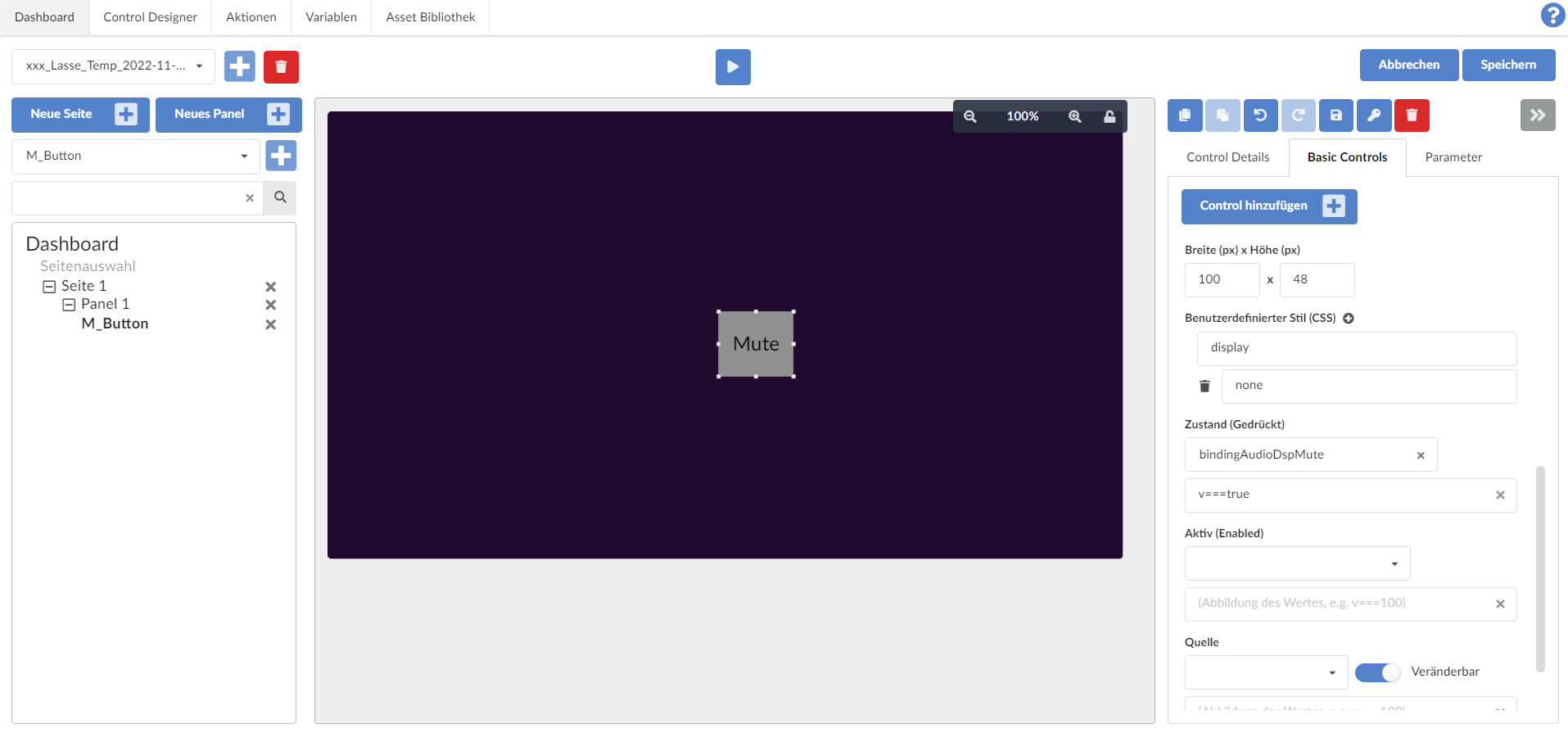
This is done by filling out the two fields under "State (pressed)" in the Internal_Switch_Mute_On switch as follows:
- "bindingAudioDspMute" and
- "v===true"
Step 9: Add Visibility Conditions for the 4 previous subcontrols
Finally, we want to make the display of the two buttons and text sub-controls dependent on whether the internal (and invisible) switch is activated or not.
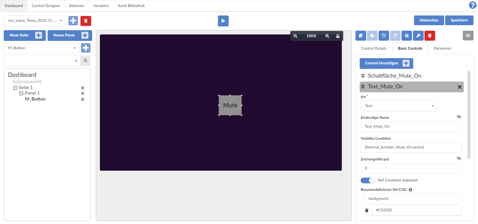
To do this, we write "[Internal_Schalter_Mute_On:active]" in the "Visibility Condition" field for the following sub-controls:
- Button_Mute_On
- Text_Mute_On:
Then we write "[!Internal_Schalter_Mute_On:active]" in the "Visibility Condition" field for the two remaining sub-controls:
- Button_Mute_Off
- Text_Mute_Off
Note: The "!" logically negates the "active" in "[!Internal_Schalter_Mute_On:active]".
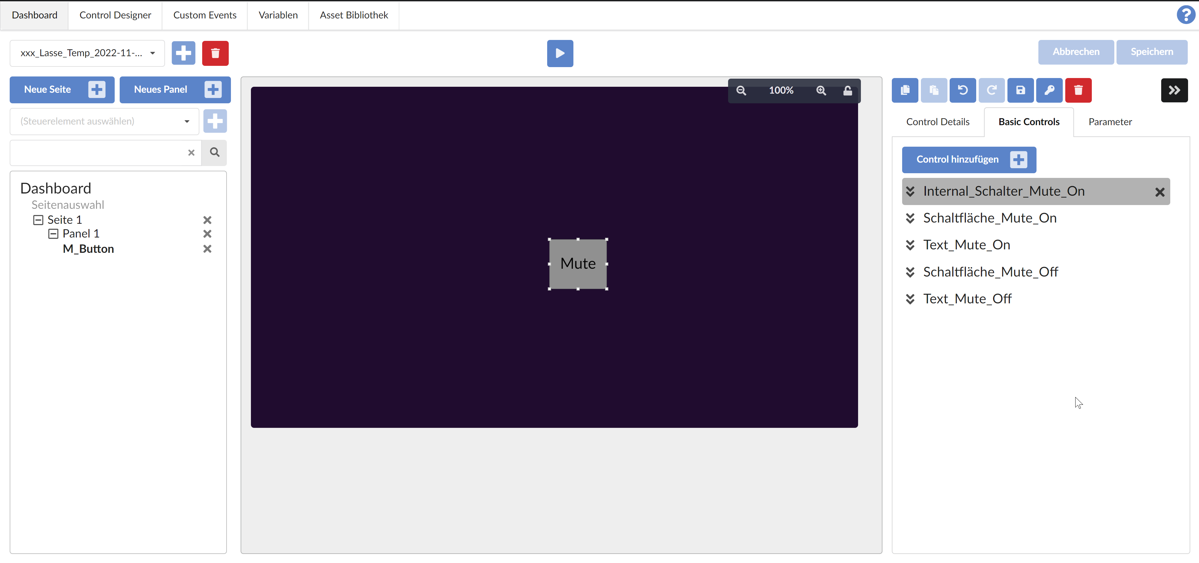
Finally, it's best to move the internal switch up using drag & drop in the sub-controls so that you can see the mute in the dashboard editing view:
Step 10: Call script block function on button click
The button currently works in such a way that it visually looks as intended depending on the state of the global variable “AudioDSPMute1”. However, nothing happens when you click the button.
So that the button causes the desired change to the global variable, we create a script block in the Script Blocks module that inverts the value of the global variable (and also creates a new custom event "AudioDSP_ToggleMute1"):
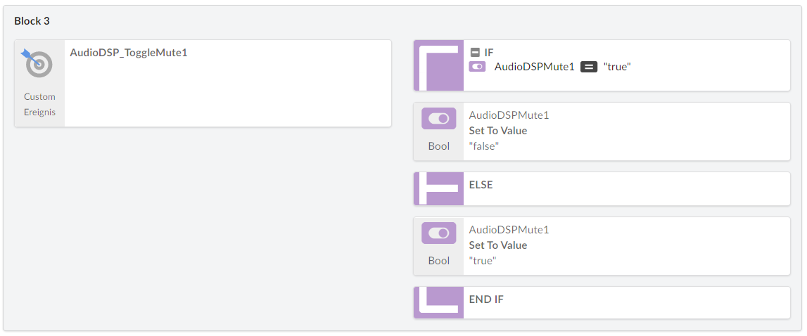
Note: This script block can be shortened significantly using a negation operator ("!"), but for clarity, this script block is implemented in detail above.
We then configure this custom event as an onClick event for the two buttons Button_Mute_On and Button_Mute_Off:
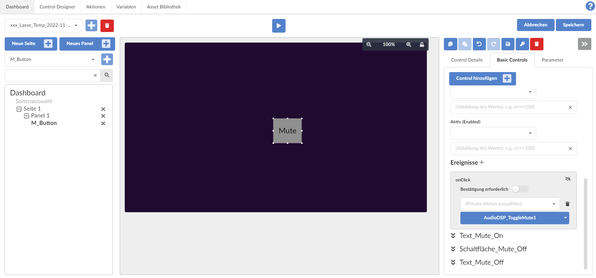
Now you can also switch the mute on and off using the button visible to the user. In fact, in the background, this one button consists of 5 sub-controls, which also contain two complete buttons, but only one of which is displayed at the same time (in the same position).
Conclusion
By adding invisible sub-controls to a control and, depending on this, displaying other sub-controls or not, you can create controls that can be perceived by the user as a purely singular control, which can look very different or even behave differently depending on the state of global variables .
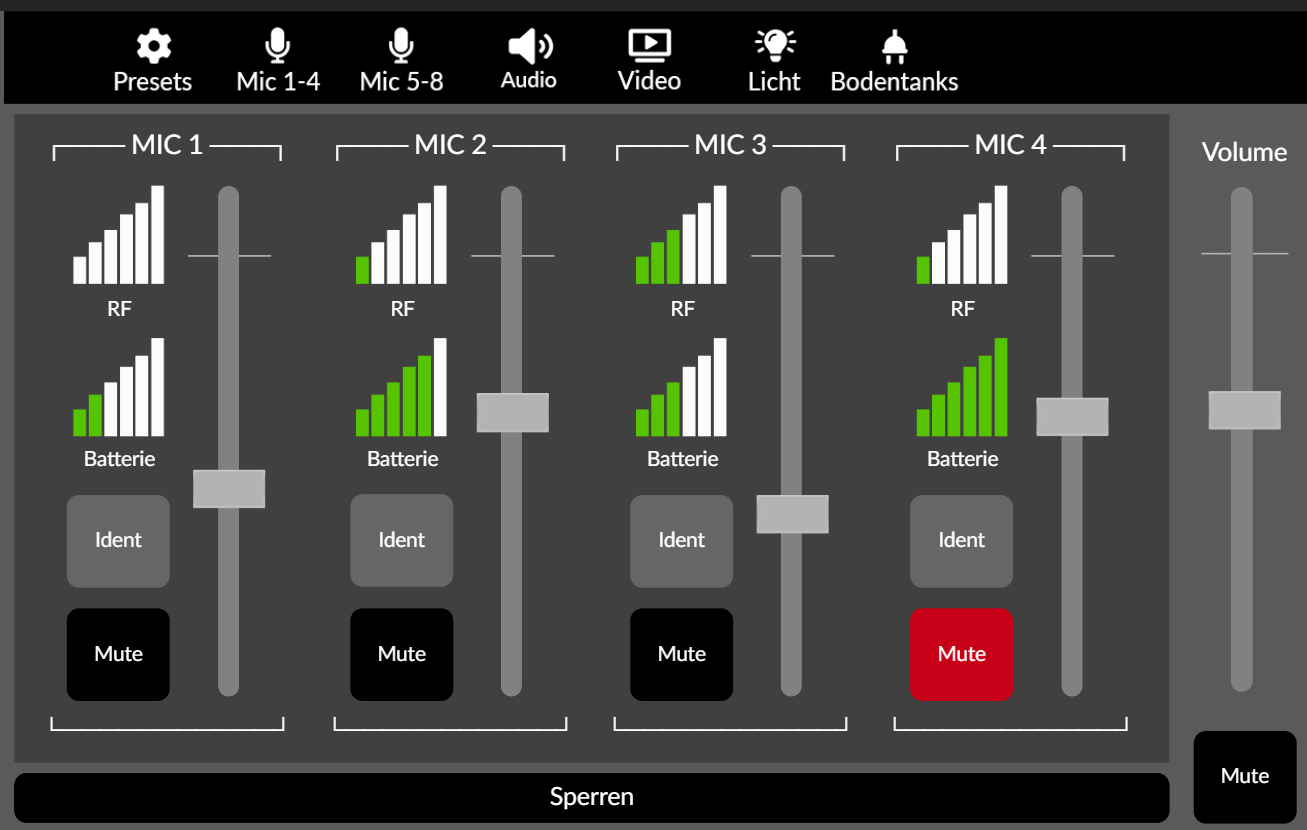
In the following dashboard, which is displayed on a touch display in a museum, for example, the bars for the reception strengths and battery levels of wireless microphones are implemented using 7 different graphics (6 bars + 'no bar filled') and a corresponding number of internal switches and Visibility conditions:
